Litmus Live Recap: How to Keep Email Design Relevant
With an average of 333 billion emails sent per day, email marketing becomes a pretty competitive sphere. Due to the low cost of emails, they’re likely to stay with us for a very long time. That’s why you should master the skill of creating high-quality emails if you haven’t done it yet.
Apart from the number of competitors, there are other challenges email marketers may encounter on their way.
Challenges for email marketers today:
- More email clients and devices than ever. According to Statista, the number of email users in 2022 is around 4.3 billion. It means lots and lots of devices and various email clients we should adapt to.
- Email fatigue and diminished attention.
- User-defined preferences such as dark mode. In 2020, Android Authority conducted research and found out that almost 82% of Android users prefer dark mode.
- Automated bots weed out and filter inboxes.
- Spam and phishing emails are on the rise. Statista reports that in September 2021 about 88.88 billion out of 105.67 billion emails were spammy.
- Firewalls block or alter email by default.
And that’s only the beginning of the list. However, we shouldn’t consider it as an obstacle to an effective email campaign. On the contrary, it allows marketers to develop their skills and create top-notch content.
3 Principles of Email Design You Must Stick to
Email design rests on three whales:
- Accessibility.
- Responsiveness.
- Beauty.
Let’s take a closer look at each of them.
Accessibility. When we talked about accessible emails before, we usually meant that the emails should contain alt tags, be scannable, and have legible font types and sizes. Now we also imply that emails should embody concision and hierarchy, optimal contrast, and use of negative space.
Responsiveness. The main requirement for a responsive email used to be the following: it should resize and display correctly on various device resolutions. With the development of the email marketing sphere, new requirements appeared. Now emails should take into account dark mode, image blockers, and optimal display for mobile versions.
Beauty. Keep in mind that apart from being eye-catchy, an email should also be a full-fledged product.
Before Going for the Design, Do an Email Platform Audit
With such a fast speed of email platform development as we see now, it’s easy to fall behind and lose your grip. Not only do email platforms move forward, but your company also does. And if your company attracts a lot of new subscribers, they may somehow change your email marketing game: for example, use a different email client than the one you’re used to, or prefer mobile devices to desktop versions. All these factors may have a direct influence on email design.
To keep abreast of any changes, every year email marketers should perform an audit and:
- Identify top email clients.
- Track the ratio of desktop and mobile users.
- Track the ratio of freemail and business email addresses.
Sample audit
Let’s imagine that you work in the B2B sphere and after conducting an audit you saw that most of your users:
- use Outlook or Gmail email clients.
- have business email addresses.
- view emails on desktop computers.
In this case, some of the email design considerations may be:
- Prioritize desktop email clients. It doesn’t mean that you should forget about mobile versions altogether. You just need to pay more attention to making desktop versions of the emails as flawless as possible.
- Firewall (image blockers). Unfortunately, you can’t control this situation. So the best advice is to create emails that would still make sense even without the images.
- Clients with poor CSS rendering. Colors, tables, buttons, and other elements of an email may differ from what you planned. And that’s very important to take into account when designing an email.
Things To Keep In Mind When Designing HTML Email Templates
Tables – thinking inside the box
Tables are the foundation of robust and responsive email design as they are:
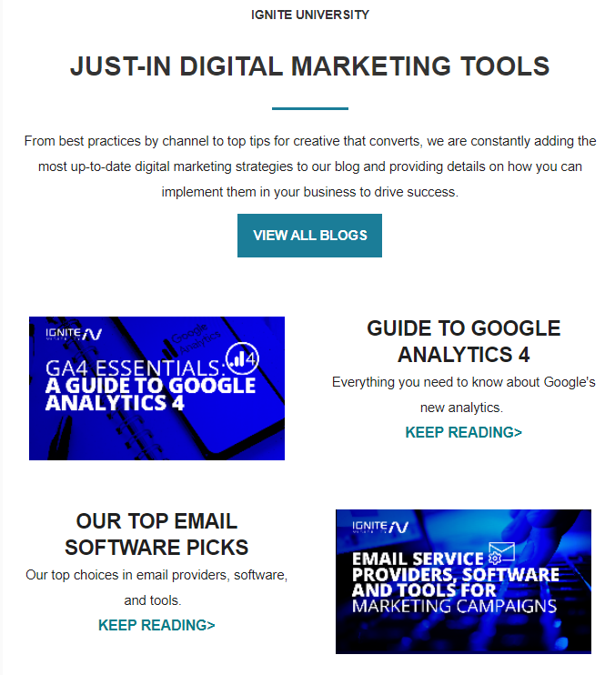
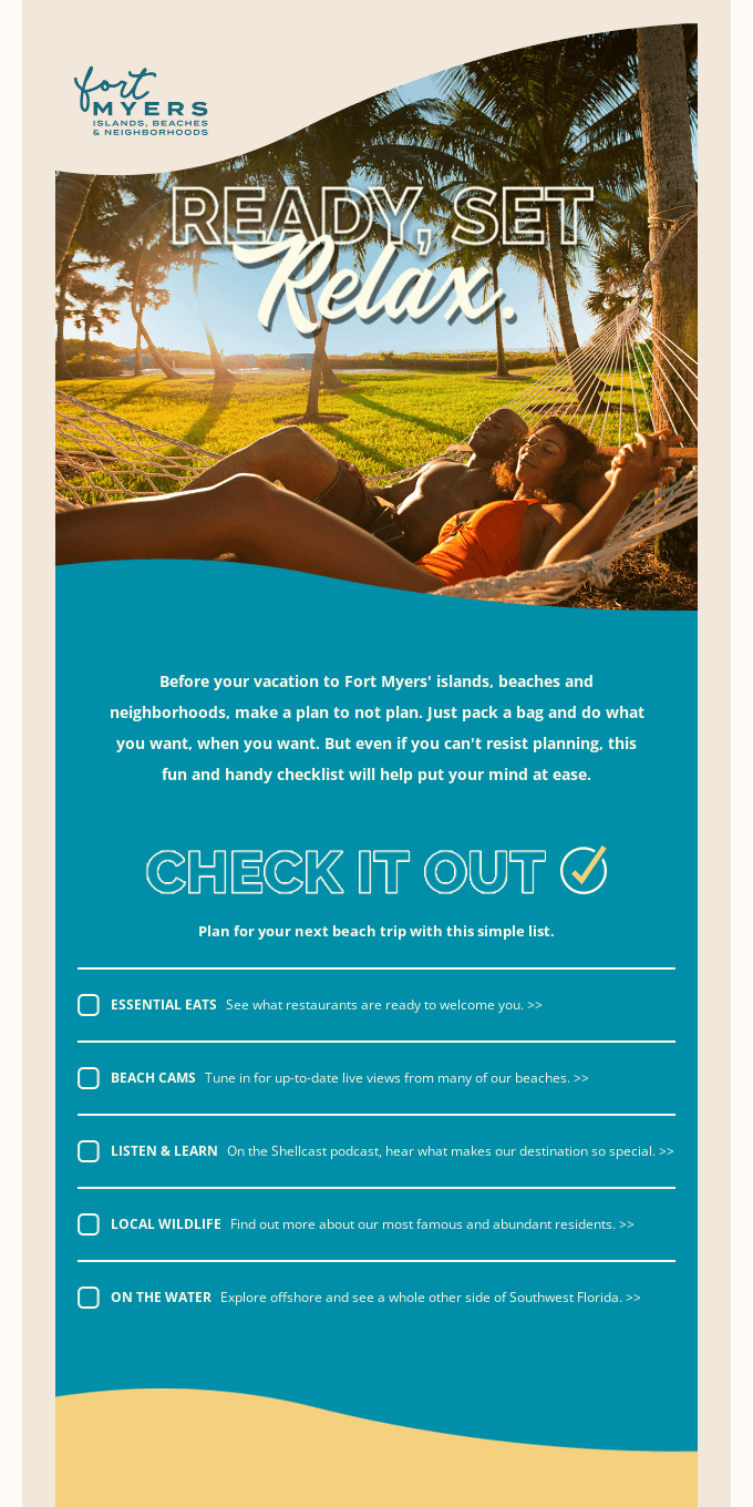
- the most consistent type of email rendering (compared to floats, padding, margins, and alignment). It’s easier to perceive information when it’s put in the form of a table. Imagine that there would be no horizontal bars in the example below. It would be difficult to navigate through the email.
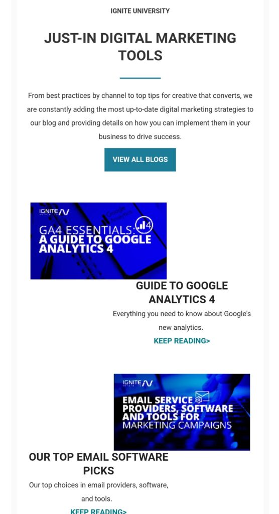
- Easier to design and control for mobile – columns collapse to rows. Compared to CSS, HTML tables work well for email clients and won’t turn your beautiful layout into something completely different, as happened in the example below.
Optimization for text
As a best practice, avoid using images to communicate text and buttons. Images are often blocked or not downloaded. If you use the combination of text and an image, the main offer remains readable even if the image gets blocked. And that’s the best thing we can do to reach the biggest number of customers.
Additionally:
- media queries or auto-resizing can help display text more optimally on mobile.
- HTML buttons are dynamic in dark mode and stand out better than images.
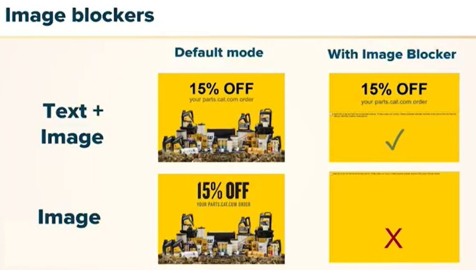
In the first example, users can still read the offer, get interested and visit the website to find more details. In the second, they don’t, thus losing any chance to learn about the offer and make a purchase. It’s a lose-lose situation both for the user and the company.
What Types of Images to Use in Your Email Template
PNGs
They are a very useful image format for innovative design and circumventing unpredictable CSS.
They enable styling options such as:
- Transparency/gradient

- Drop shadows
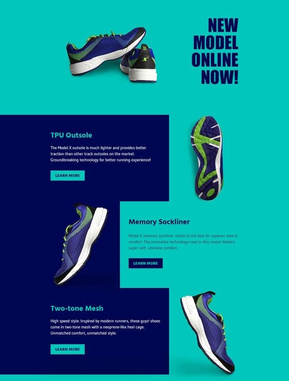
PNG images can also be sliced to separate email sections, especially to transition different background colors.
This is useful to create visual separation, highlight information, and improve readability.
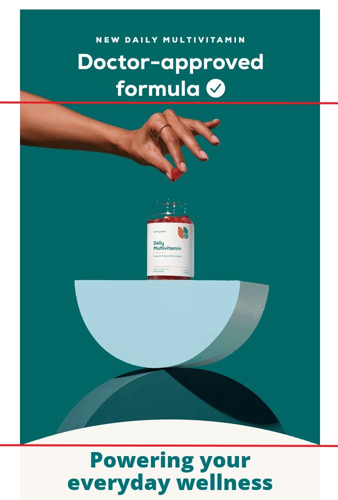
GIFs are no longer a format to avoid:
- preferable to Flash. Of course, Flash allows you to create interactive animations but to interact with them users should have the Flash player. Otherwise, it’ll be just a simple GIF.
- loops create seamless animation. If you do everything right, users won’t even notice that the GIF repeats itself.
- fewer colors = smaller file sizes, so your emails will download faster.
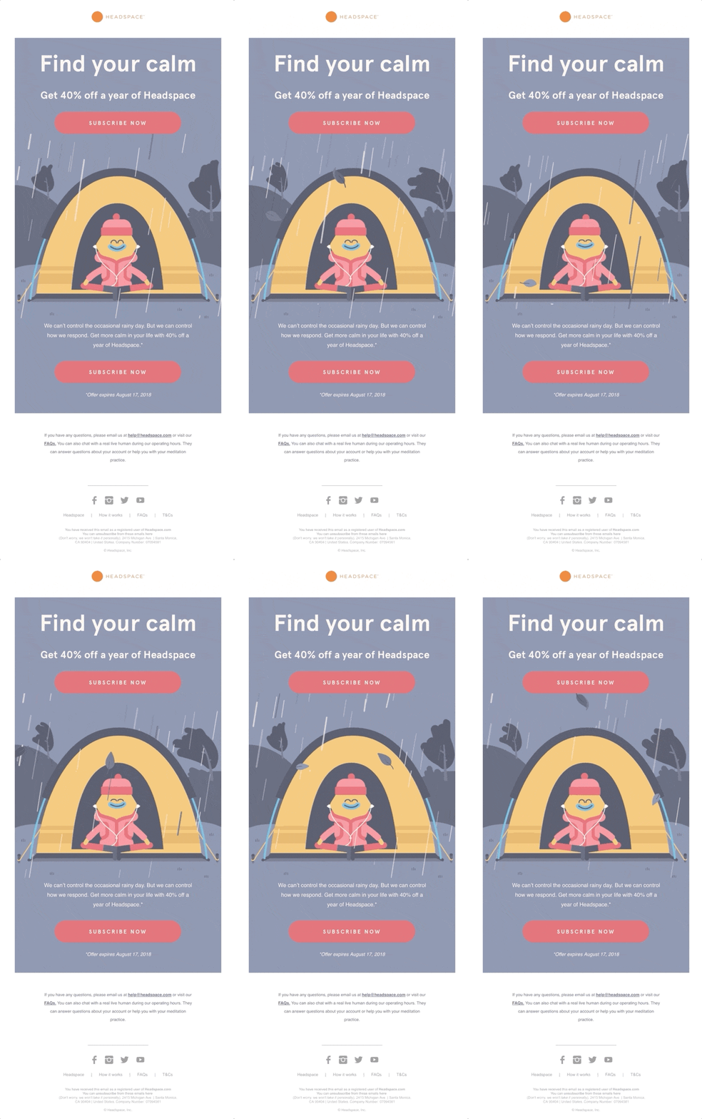
Digital illustrations are also a must in the world of email design in 2022. A digital illustration is a kind of art created with the help of digital tools. Don’t mix it up with edited photos, digital illustrations are made from scratch.
They have the following advantages:
- versatile, can be easily scaled, edited, and repurposed. As a result, you spend much less time creating visual content for your emails.
- can communicate branding when CSS elements are unpredictable. While CSS elements may change their color (and ruin your original idea), digital illustrations remain the same no matter what email client subscribers use to read your emails.
To make the best of digital illustrations, follow these tips:
- Stylize with drop shadow, stroke, or padding (if JPEG). It’ll make your digital illustration look more real-life.
- Opt for mid-tone colors so images do not blend in dark mode. This way they will look gorgeous no matter what mode the subscriber uses to read your email.

CSS (Cascading Style Sheets) is a part of code used in HTML emails to change email design: fonts, colors, paddings, etc. It’s a very convenient yet tricky instrument, as in some clients CSS may display incorrectly, thus changing your email into something different, as in the example below.
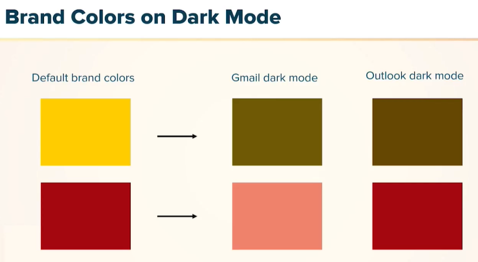
That’s why you should be careful and test emails containing CSS across various email clients to avoid any unpleasant situations.
Key Takeaways
- Prioritize the needs of your email client and design accordingly. Don’t waste time on things that prove unnecessary.
- Optimize time and resources (build robust templates for recurring use cases). This way you’ll free more time for other important tasks.
- Embrace and adapt to paradigm shifts within email such as responsiveness and dark mode. You need to keep up with the times to make your emails relevant.
- Feel empowered to educate your development and design teams as you bring critical insights and expertise. Remember that all of you have the same goal and need to work together to achieve it.
Litmus Live is a marketing conference that lasts for 2 days and brings together lots and lots of digital marketing experts. We’ve taken some notes during Ali Mahad’s lecture on “Accessible, Responsive, and Beautiful Email Design in 2022”, added some numbers and ideas of our own, and turned this material into an article that will help you navigate in the field of email design.
Create an email template in Blocks and try out these techniques!
If you want to learn more about other email marketing conferences and expos, read our articles about the upcoming email marketing conferences of 2023.
