A Guide to Reminder Emails: Examples & Best Practices
Ever had a feeling that you’ve forgotten something?…
In our fast-paced world, it’s not easy to keep up with the daily information flow. At times, you may even lose track of something you actually anticipate!
This poses the question for companies and marketers: how do you keep customers in the loop? Through the power of reminder emails! They help your subscribers stay informed and, when done right, might become a wonderful solution to turn potential customers into active ones.
Dive into our in-depth article to discover reminder email best practices, get inspired by creative and gentle reminder email examples, and see how Blocks may help you craft your best reminder email templates.
5 Main Reminder Email Types
What exactly are reminder emails? As the name suggests, their purpose is to remind the subscribers about something important, urgent, or potentially interesting. For example, they may prove useful in the following situations:
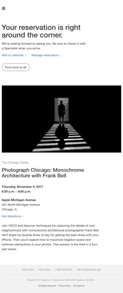
1. Event or appointment. Whether it’s a live show or a check-in at the hotel, make sure that your customers don’t miss it. For this, prepare an appointment reminder template (or a “save the date” email template) that contains the day, time, location, and other crucial information.
Take a look at how Apple announces the upcoming event in its reminder email example.
2. Sales or limited-time offers. Limited sales period is around the corner? Remind your subscribers about it and convert them into buyers! Showcase the upcoming offers, and use dynamic content to enhance personalization.
On top of that, reminder emails will be especially useful if you:
- hold sales earlier or later instead of a more established shopping day (or even hold a unique sale that’s not tied to any occasion);
- provide a very specific, brand-exclusive offer.
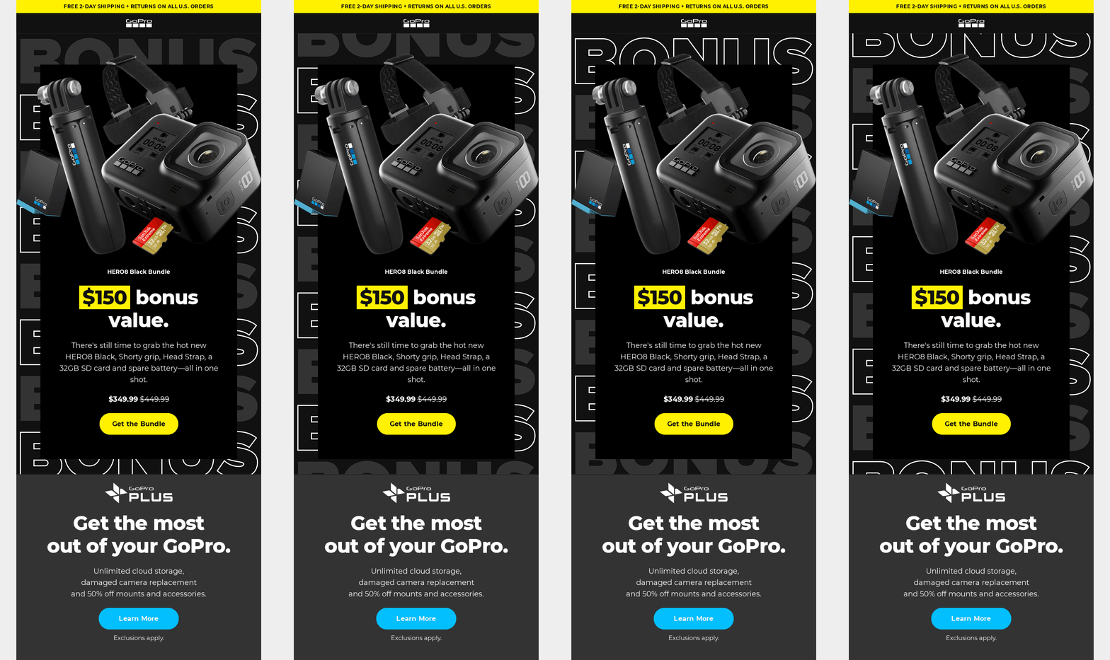
Here’s an effective reminder email example by GoPro that emphasizes a limited-time Black Friday bonus value.
3. Trial period or subscription renewal. Always remind your subscribers when a trial period for your product is coming to an end. Offer them to acquire a full version and ask to share feedback.
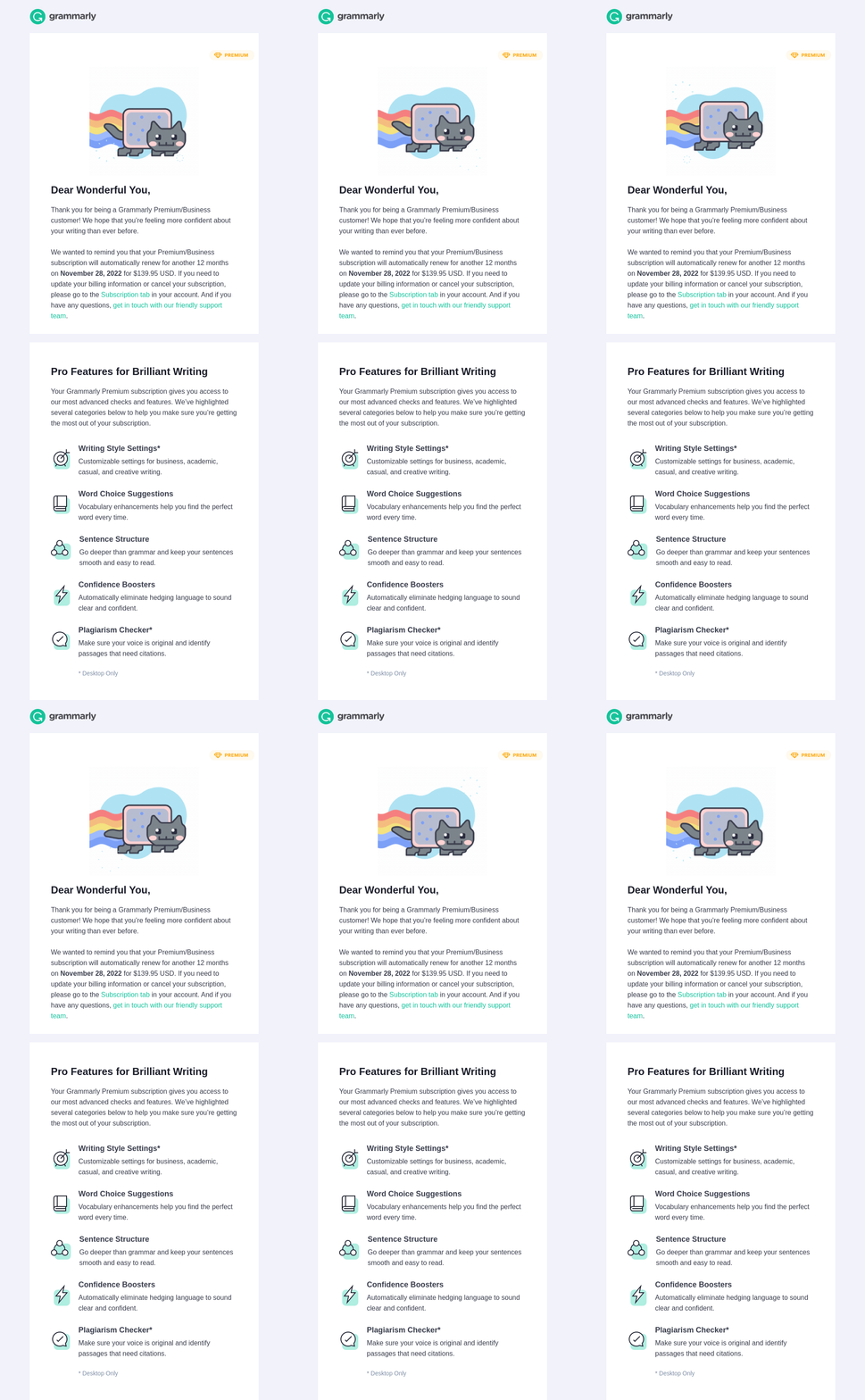
The same goes for subscription renewal: notify the subscribers about it and ask if they want to update their information, switch to another plan, or maybe even opt out.
Grammarly provides a creative yet gentle reminder email example that informs the customer of the upcoming subscription renewal.
4. Abandoned cart. Picture this: a user visits your website, looks through the goods, even adds some to their cart… but in the end doesn’t buy anything! Whenever someone forgets to check out, it’s time to send reminder emails.
There are 2 solid reasons for why that’s important:
- With an open rate of almost 40%, abandoned cart reminders are your chance to turn a potential customer into an actual one (since they’ve already shown active interest).
- You may propose some other goods along the way! Special offers and “You may also like…” lists might make the customer buy even more than initially intended.
Here’s a reminder email example by Grove Collaborative that shows both the abandoned cart contents and the “Recommended For You” section.

5. Additional action. Certain events (like an order confirmation or a service setup) require extra steps to complete. Yet some users might stop halfway through and never proceed to the next stage.
When that happens, remind them about the unfinished business. Additionally, you may offer support in case the subscribers face problems or difficulties.
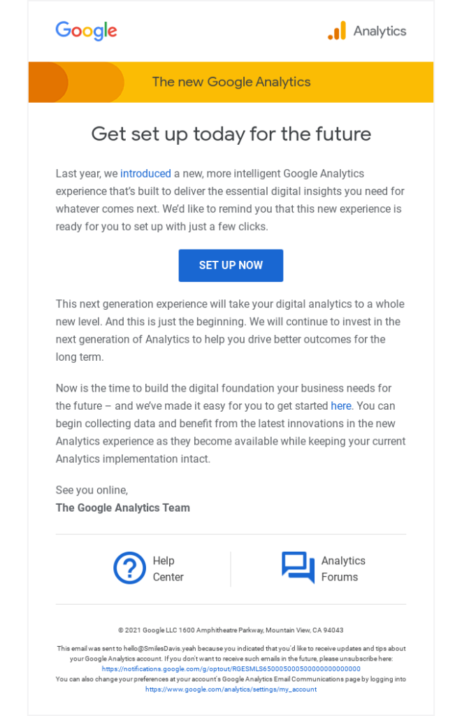
For instance, here’s a reminder email example by Google that notifies the subscriber about setting up the updated Google Analytics.
Need an effective tool to craft your reminders?
Build your reminder emails with Blocks!
8 Reminder Email Best Practices
From time frame to content, reminder emails require attention to details for maximum effect. Let’s take a look at 8 best practices (along with excellent reminder email examples) that will help you create your perfect reminders and unlock their full potential.
Mind the timing
According to the statistics, 48 to 72 hours after your initial email is the best time to send a reminder. Yet the appropriate time frame here is determined by many factors, including the specifics and scale of your business, event type, and customer behavior.
Provide analysis to determine the timing that suits you best:
- a reminder sent too late obviously doesn’t give enough time for action and loses any meaning whatsoever;
- a reminder sent too early, on the other hand, risks being lost in the sea of other emails and eventually forgotten.
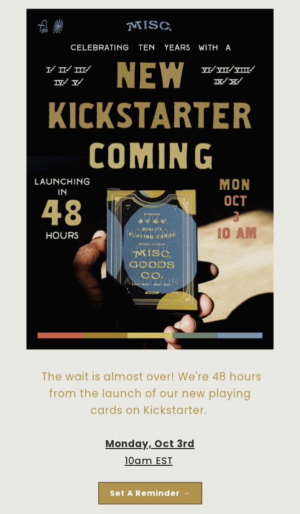
Take a look at the timely reminder email example by Misc. Goods Co, sent 48 hours before its product launch on Kickstarter.
Go straight to the point
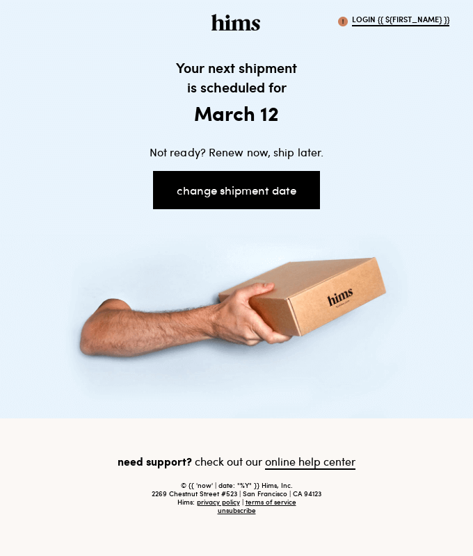
Since users spend only about 9 seconds on a single email, there’s no room to beat around the bush. Keep your reminder emails straightforward and use them to directly communicate the primary message. Include all the information that your customers need and make it noticeable at first glance.
Here’s a very interesting email by Hims to illustrate this advice. Not the most gentle reminder email example, but definitely one of the most direct we’ve ever seen.
Personalize the email
Use personalization to connect with your audience on a deeper level. For instance:
- Personalize your reminder email starting with the subject line and continuing all the way through. We’ll get to subject line personalization later.
- Begin with an appropriate greeting and address the recipient by name in a formal, playful, or simply neutral tone (in line with the reminder email type and your brand identity).
- Showcase offers based on customer’s preferences or previously ordered/viewed products, and include dynamic content. This provides additional engagement and makes the email look like it’s tailor-made for a specific subscriber.
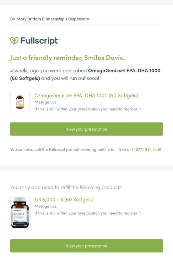
Check out this gentle reminder email example by Fullscript: it includes the recipient’s name right in the first line and offers to re-order prescribed medications for this specific customer.
Indicate the deadlines
Need to remind your subscribers about something time-sensitive? Show that in your emails. Include the deadline, or even create a straightforward “save the date” email template and directly ask the recipient to mark the day and time in their calendar.
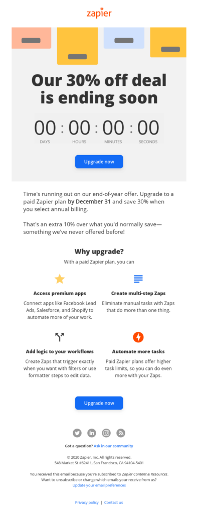
And if you wish to underline urgency, add a countdown timer and propel the customers to act fast! Here’s an excellent reminder email example by Zapier that shows how it can be done.
Provide clear instructions and directions
Customer experience is an important and delicate matter: while some things might be obvious for you, they become a riddle for your subscribers. Simplify the process or provide proper instructions in your reminder emails.
This will help the customers overcome any difficulties they might face. Keep the information clear and easy to understand for any user, regardless of their knowledge or experience.
For example, you might need to inform your subscribers on how to:
- renew a subscription;
- get to a specific location;
- access an online event (i.e. what software or website to use), etc.
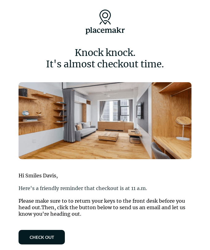
Placemakr provides a playful yet gentle reminder email example that instructs the recipient on how to check out properly.
Adapt for mobile
More than 82% of U.S. citizens are smartphone users, and their number grows every year. Many of them take smartphones wherever they go and check their messages (including emails) on a regular basis.
It’s very likely that your reminder emails will also be read on a smartphone. As such, they must be responsive, look good, and work properly on desktop and mobile alike.
Craft your responsive reminders with Blocks!
Create 100% responsive emails that look great on any device!
Here’s a reminder email example by DoorDash that’s both mobile-friendly and informative.

Make use of CTAs (calls-to-action)
If you expect a fast reaction from the subscriber, include a proactive CTA in your reminder email! Here’s a small recipe for a perfect CTA:
- it’s engaging and drives the subscriber to action;
- it’s brief yet direct with what you want the subscriber to do;
- it’s immediately noticeable among other email elements.
Keep the CTAs short and include phrases that will make the recipients take the desired action. Depending on the reminder type, this may be something like “Sign Up Now”, “Claim Your Bonus”, or “Show Me More!”. Finally, use no more than 2 straightforward CTAs per email to exclude any possible confusion.
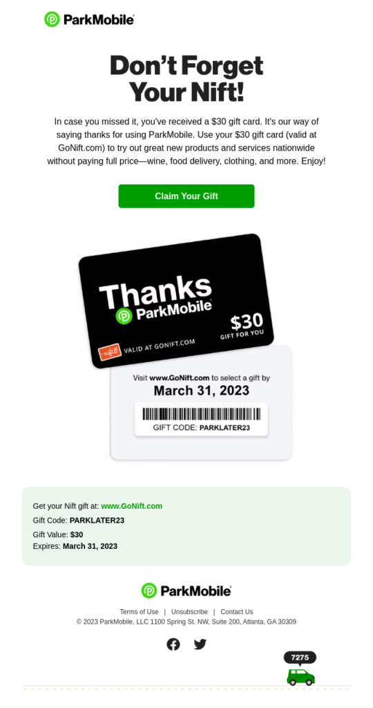
Park Mobile demonstrates a fantastic reminder email example here. Immediately after opening it, you’re greeted with a gift card and a CTA that reads “Claim Your Gift”.
Don’t send way too many reminders
Reminder emails might prove vital for your strategy, but only if you don’t overuse them. 1 or 2 reminders are perfectly fine: they won’t disturb the subscribers, and some of the customers might actually be grateful. But an abundance of emails would probably irritate or even anger your audience.
Analyze your subscribers’ behavior and plan the strategy to keep them informed without going overboard. And, of course, provide an option to unsubscribe if they don’t want to receive any more emails from you.
Craft Your Reminder Emails Using Blocks
If you’re looking for a tool to create reminder emails fast and easy, look no further than Blocks! Craft the email from zero or check our template gallery to find the ideal option, be it an abandoned cart or an appointment reminder template.
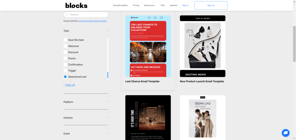
Blocks allows you to design any reminder type, from a simple “save the date” email template to a content-packed limited-time offer. Create your excellent emails within minutes: simply drag and drop the elements, and customize them as desired!
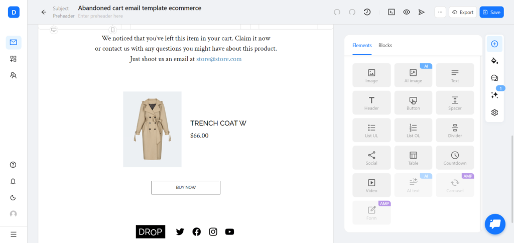
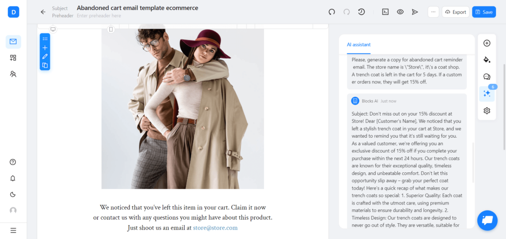
And if you wish to save even more time, you can count on the AI capabilities of Blocks! AI image generator will provide excellent visuals for your template, while AI assistant will lend a helping hand with the email copy.
5 Tips for Reminder Email Subject Lines
The reminder email subject line is a pivotal ingredient of your message and deserves special attention. It’s the first email element that comes into the subscriber’s view, and may even influence the decision to open the reminder.
These 5 tips will help you create a compelling reminder email subject line and immediately catch the subscriber’s attention.
1. Make it short. With only 60 characters available for desktop and around 30 for mobile, subject lines don’t offer much space. Even so, there’s still enough capacity to convey the required information (and show off your creativity).
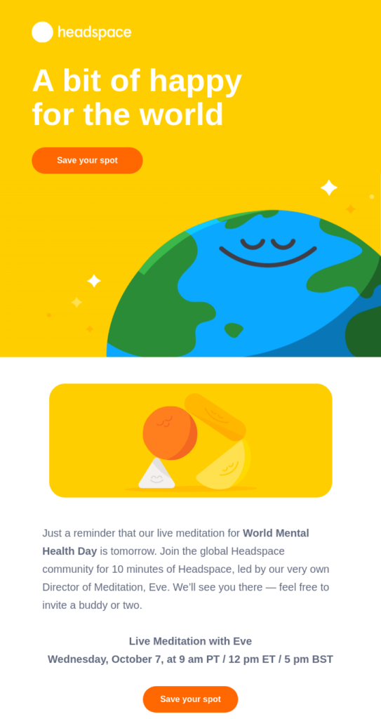
Headspace, for example, came up with a simple yet excellent reminder email subject line that says “See you tomorrow”.
2. Keep it precise. Character limit calls for a straightforward approach. Use the reminder email subject line to communicate the purpose of your message before the recipient opens it. You may even start with the word “Reminder” and get right to the point.
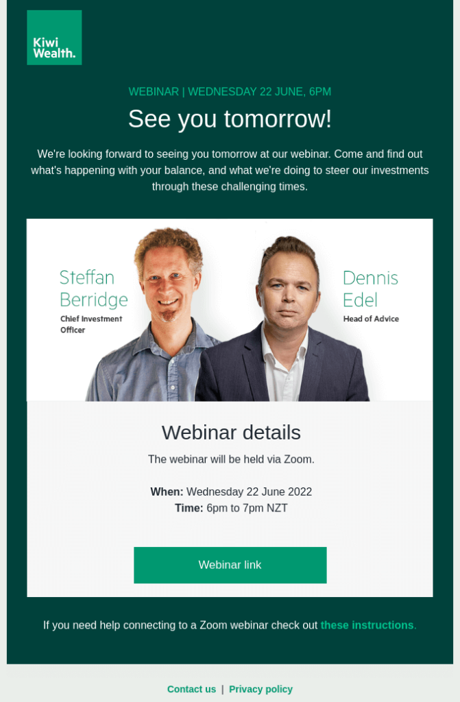
Here’s an example of such a reminder email subject line by Kiwi Wealth that reads “Reminder! Our webinar is on tomorrow”.
3. Include the name. Personalize your reminder email subject line by including the subscriber’s name. Make it straightforward, like “John, the Event is Up Tomorrow”, or a bit playful, like “Hey John, Did You Forget About Something?”.
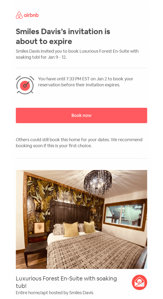
Airbnb shows a great example here, with a reminder email subject line that reads “Reminder to book Smiles Davis’s place”.
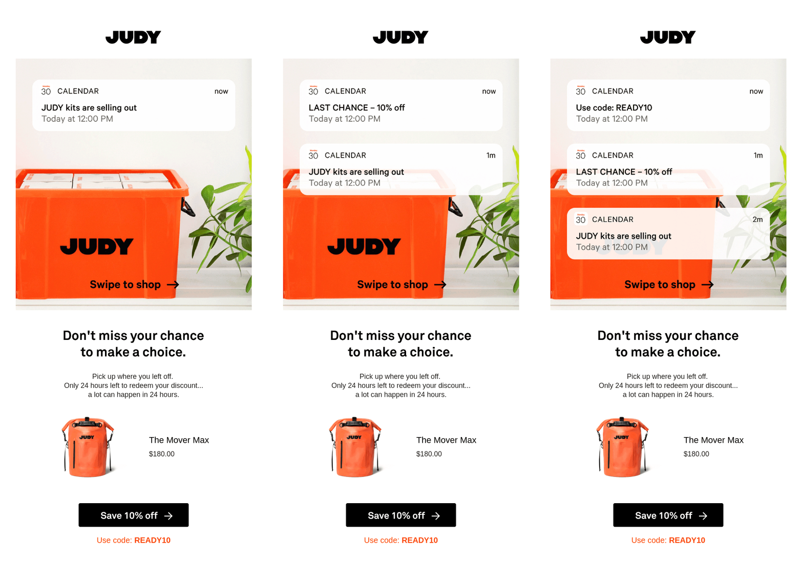
4. Create a sense of urgency. Use the reminder email subject line to drive engagement. Even a single phrase, like “Only 2 Days Left!” or “Offer Ends Tomorrow!”, might explicitly showcase urgency and lead the recipient to take action.
Here’s an awesome example by JUDY: a reminder email subject line that says “friend, your discount is expiring!”.
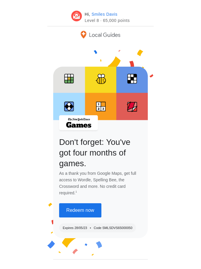
5. Use emojis (if appropriate). Fun fact: users are 56% more likely to open emails when their subject lines contain emojis. Include an emoji that’s close to the email topic or simply fun and attractive (though, of course, remember to keep the emojis reasonable and don’t overuse them).
A great illustration here would be this reminder email subject line by Google that reads “🎉Don’t forget to redeem your Local Guides reward”.
Boost your email production!
Build reminder email templates in a few clicks with Blocks.
Conclusion
Reminder emails are an integral part of online businesses: they might affect event attendance, buying activity, and overall customer engagement. Ready to craft yours? Here’s a quick rundown on how to make the most of your reminders:
- mind the timing and give the customers enough room to act;
- personalize starting from the reminder email subject line;
- showcase the deadline and create a sense of urgency;
- indicate all the necessary details and double-check the contents of your reminders;
- keep the reminder emails polite and straightforward;
- provide clear instructions and directions whenever needed;
- ensure that your reminder emails look and work properly on any device, be it desktop or mobile.
Whether you wish to craft a gentle reminder email or strive for something more adventurous, Blocks will become your perfect assistant. Create a free account right away and get ready to build your best reminder email templates ever!
