2024 Hottest Email Design Trends: 9 Expert Tips & Examples
2024 brings us a whole bunch of email design trends. Some are on the “familiar yet fresh” side, while others come out as quite unexpected. But one thing’s for sure: you wouldn’t want to miss out on them if you wish to take the lead in marketing competition.
With this in mind, we’ve asked the email experts about the 2024 design trends, carried out in-depth research, and now we’re happy to present you the results:
- 9 design trends & strategies behind their success;
- 7 insights from email marketing experts;
- 4 ready-to-use trendy templates from our team to elevate your marketing game;
- numerous examples for additional inspiration.
So, without further ado, let’s dive right in!
Trend #1: Gamification
Let’s kick it off with one of the most engaging email design trends in 2024. Gamification tactics add a whole new layer to your marketing strategy, bringing unique feelings of immersion and excitement that can only be achieved through interactivity.
This can take various forms in your emails, including:
- mini-games of different kinds and genres;
- interactive quizzes with special offers based on the answers;
- scratch cards that reveal unique prizes;
- and many, many more!
If you’re ready to use gamification in your email campaigns, these 3 tips will help you make the most of it:
- Avoid complexity. The golden rule for gamification in emails is to keep the interactions straightforward and simple. Your games must remain 100% intuitive from the get-go.
- Offer rewards. Games are all about rewards and achievements! Provide those in your email as well: for example, give the recipient a bonus or a discount for a successful completion.
- Personalize. Boost engagement to the max by adding a pinch of personalization! For instance, provide user-specific rewards to make the experience even more fulfilling.
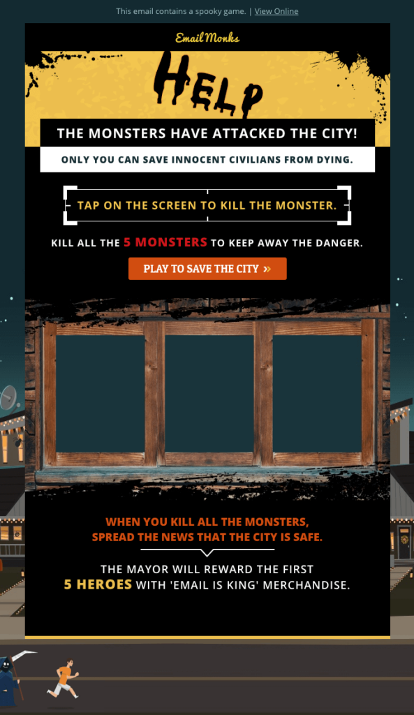
The gamification tactic is something that will get some momentum in 2024. It implies that we need to add some design features to our emails to work according to each feature.
For instance:
– Having multiple choices to define segments and topics of interest.
– Multimedia decoys to bring people to a storytelling lineup that starts on email but extends to video, interactive webpage inputs, and a “choose your path” kind of approach.
– For those using Gmail and Yahoo! in particular, AMP for Email is also trendy and allows more engagement from those users. From a design standpoint, it is a bit of a challenge, but when done right, it is super effective to get more conversions depending on the market/audience or goals.
Looking around, I’m also seeing interactive content in the emails, which I love! It reminds me of the experience of a website, but more tailored.
Trend #2: Vintage
The saying that “history repeats itself” rings true for trends as well: they come and go, yet at times turn full circle! 2024 offers us a throwback to the past, bringing back design elements from decades ago.
Stylized “old-fashion” photos, design approach straight from the 70s, or references to the 80s and 90s pop culture? Why not! Even something that has long been out of fashion might make the cut!
But what exactly makes vintage design successful?
- Nostalgia. 8 out of 10 people experience nostalgia at least occasionally, which makes it the driving force behind everything vintage. It brings us to the time when things felt more joyous, giving a laid-back and comfy feel. And who wouldn’t want to escape from all the modern hassle into simpler and calmer times, even just for a minute?
- Familiarity. Yep, you’ve definitely seen those before, at least caught a glimpse. For a lot of people, vintage elements feel familiar, sentimental, and in turn, a bit more trustworthy.
- Relevancy. Some products and brands thrive on vintage and nostalgia. Classic and “old school” apparel brands, vintage goods shops, or companies with decades-long history might make the most of the nostalgic design.

In my opinion, vintage design holds special value due to its association with retro styles and nostalgia: they bring both aesthetic pleasure and a deep connection to the past. Everything from fonts to pastel & dusty shades to textures takes you on a virtual journey, bringing a unique atmosphere into each email.
I think that vintage will remain a recurring trend, and will continue to come back in new interpretations. Still, it’s important to maintain the balance between vintage and modern, especially when it comes to comfort and functionality.Julia Gruzdeva, Designer @ Blocks
Trend #3: Block Layout
Ever noticed the emails that look like they’re built from blocks laid out on top and beside each other? This trend has been around for a while, and it’s becoming more and more popular every year!
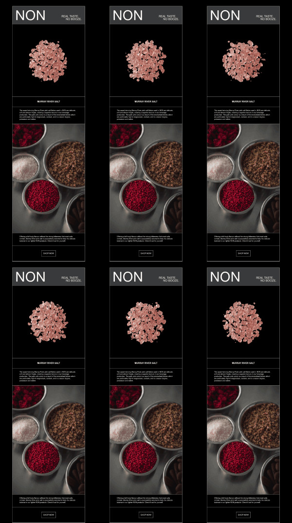
You may say that block layout design resembles brickwork (or maybe a bookshelf). Each segment is visually independent: you can achieve this effect using spacers, borders, or different background colors. Simple yet effective, this design trend is a total win:
1. It gives the email a more organized look. Since the template is divided into clear, specific sections, you can draw subscribers’ attention to the most important elements.
2. For marketers, this is a pretty easy and cost-effective option thanks to email editing tools. Email builders generally don’t require any specific skills and make the process of crafting the templates fast and accessible.
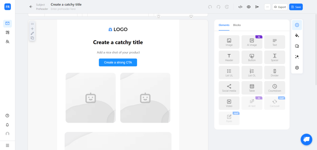
If you’re looking for a go-to email builder, try Blocks! All that’s required is a free account: add a new project, create a blank template, and get ready to design your superb emails in minutes.
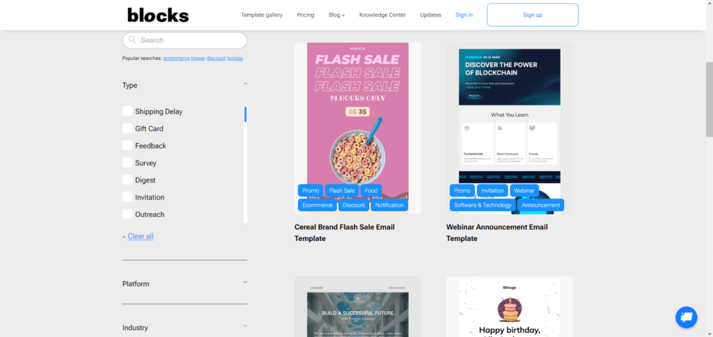
Not ready to craft the email from scratch? Visit the template gallery! With dozens of beautiful options for different categories, our selection of customizable templates will suit every taste and become a perfect addition to your campaign.
This design approach was used quite often in the past, and now it’s experiencing a renaissance. Even giant corporations tend to create most of their emails by highlighting content blocks through borders or background colors. These blocks help to clearly convey the email structure and underline its important aspects. On top of that, they also echo the increasingly popular widgets in web and app interfaces.
Trend #4: Minimalism
One of the crowned champions in design, minimalism is not going away any time soon. On the contrary: in 2024, it’ll strengthen the positions even further!
Many brands and companies adopt a minimalistic approach in their marketing campaigns, and for a good reason. It offers a whole string of advantages, for instance:
- minimalistic design keeps the email clean and makes the layout much more pleasing to the eye;
- it’s easy to highlight the most important details of your message;
- your email will not only be easy to read, but also lightweight (and, in turn, will load fast);
- minimalistic emails can be crafted quickly and inexpensively since you won’t need to spend a lot of resources on the design.
It’s not just about visuals: you may also turn to minimalism in the text itself, or even compose a text-based email! This will help you keep only the necessary information and focus the email around one main goal (i.e. make a purchase / visit the website / sign up, etc.).
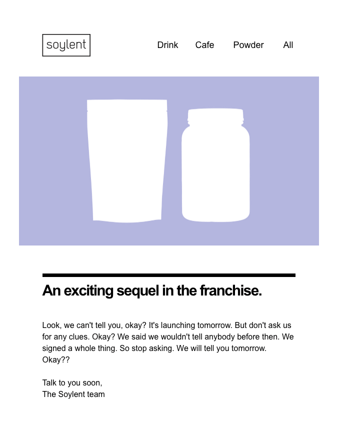
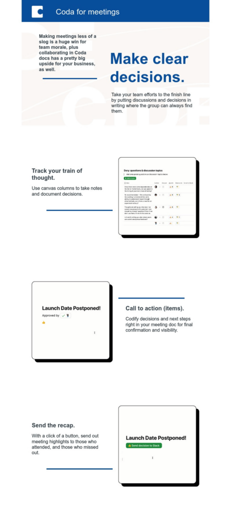
Minimalistic and text-based emails will take off in 2024.
And people want emails that talk to them just like someone is having a conversation with them in a coffee shop: from the heart and written like we’re having a conversation.
Trend #5: Drop Shadows
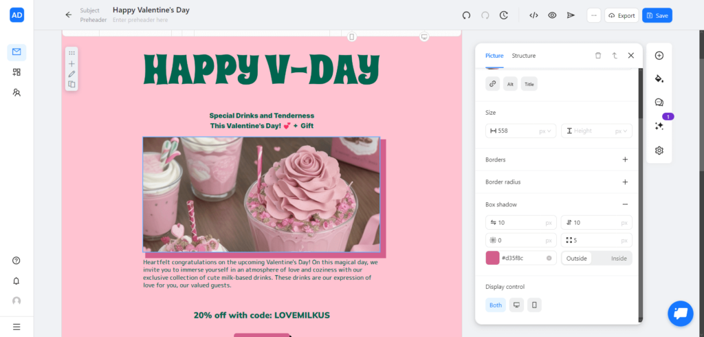
Drop shadows, a visual technique that resembles the 90s design trends, is probably the most unique (and somewhat underrated) trend that already picks up steam in 2024!
The most notable aspect of drop shadows is their ability to add depth to imagery and typography. This creates a sense of space and makes the email element (like an image or a CTA) look like it’s physically there.
What’s best is that shadows may come in different visual forms (including pixelated and solid color), and still look great! Finally, this small detail allows for mixing both modern and vintage styles, which gives your emails a truly unique look.
And if you use Blocks, adding a drop shadow to your image becomes a piece of cake. The “Box shadow” parameter offers all the required options, from size and position to color and blur radius.
Trend #6: Dark Mode Compatibility
The light-on-dark color scheme (simply known as the “dark mode”) emerged several years ago and took the world by storm. In 2024, it dominates the websites, apps, and user interfaces: even tech giants like Google, Apple, and Microsoft couldn’t resist!
The number speaks for itself: up to 95% of users prefer dark mode for most interactions, from browsing the net to reading emails. Obviously, it’s not a fad, but a significant and noteworthy matter.
But does the dark mode craze actually benefit emails? Yes, it does! In 2 particular ways, to be exact:
- When properly crafted, dark mode-friendly emails become aesthetically pleasing. The palettes and the game of contrasts make the message look slick and modern, and help to highlight both text and visuals.
- Dark mode might enhance readability and is much more comfortable for users who read in low-light environments. Be cautious, though: excessive contrast may cause eye strain, so try to avoid extensive brightness as much as possible.
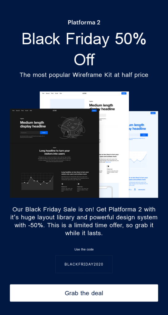
I think that dark-mode friendly emails become highly demanded nowadays because dark mode emphasizes attention to detail and meets the needs of different users. However, you should consider some important aspects when creating a dark mode-friendly email.
First, pay close attention to the color scheme. Ideally, try to avoid a pure black background and stick to shades of black to ensure a comfortable viewing experience.
Second, optimize visuals for the dark mode to maintain contrast and enhance your email.
And third, dim bright colors that may cause discomfort when viewed in the dark.
It should also be noted that some email clients might not support dark mode. Therefore, make sure your email looks great in both the light and dark modes for maximum effect.Julia Gruzdeva, Designer @ Blocks
Trend #7: Subtle Palettes
Here we have a trend that challenges bold and bright colors! Along with the unconventional typography and drop shadows, this might be one of the most surprising trends to emerge in 2024. You might say that it takes bits and pieces from both minimalism and vintage (it sure does), yet still remains its own thing.
This is what makes subtle colors work in an email:
- They bring a sense of warmth and comfort. Soothing color palettes provide a calming effect and make the tone of your message more relaxing.
- They add elegance to your email. And just like with the palette itself, this elegance isn’t strict but rather delicate and cozy.
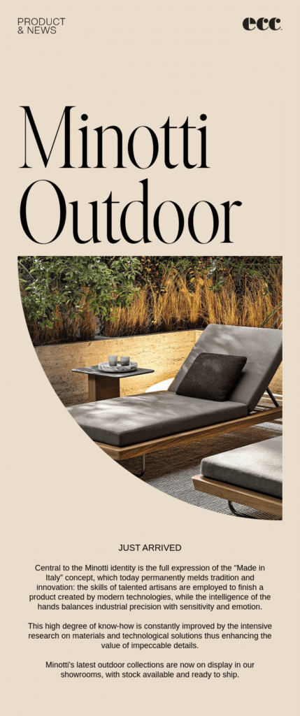
The power of subtle colors can’t be underestimated: even Pantone recognized Peach Fuzz (the soft, pinkish-orange hue) as the color of the year 2024! Some industries (like health & wellness, for example) might especially benefit from the smoothness of dimmed colors and use them to convey the required emotions.

But of course, it’s not limited to these industries alone. For example, here’s how ECC New Zealand presents its Minotti Outdoor furniture line using soft colors that bring along the general feeling of peacefulness.
Trend #8: Animations & Videos
Definitely no strangers to emails, animated GIFs are simply excellent when you need to bring dynamics into your message. No wonder they remain the hot design trend in 2024!
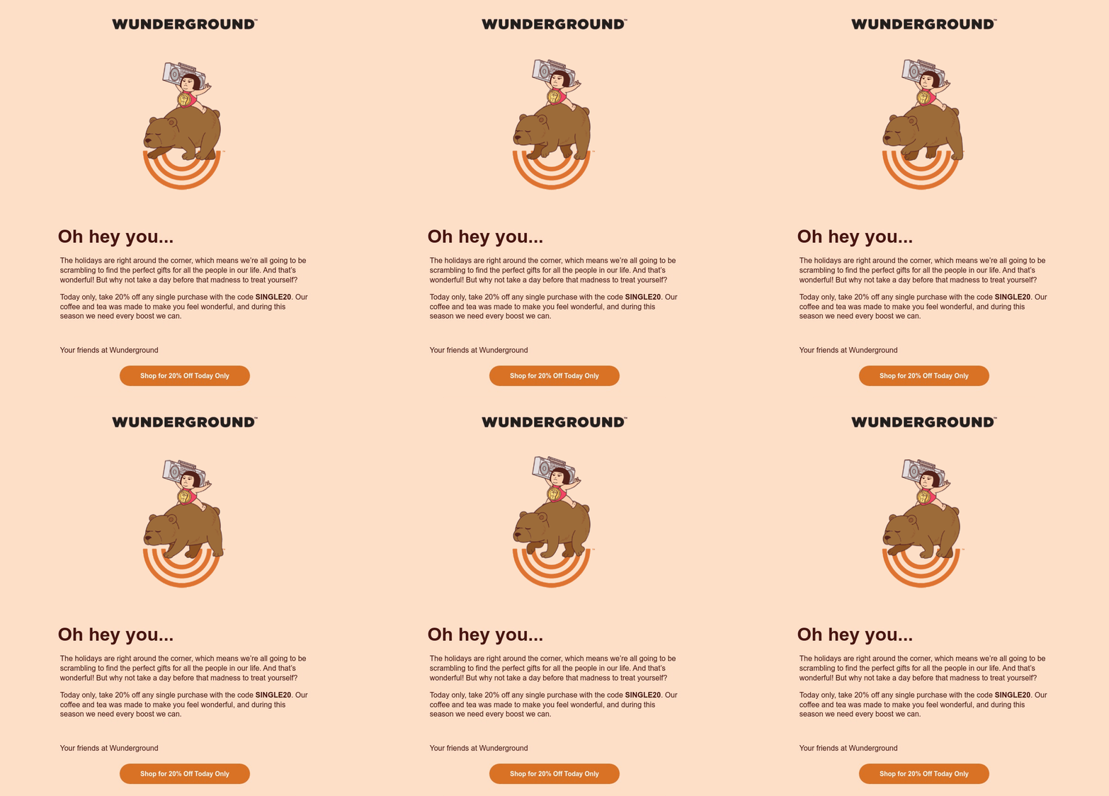
And here’s a fun fact: believe it or not, 54% of subscribers prefer emails with videos! They are perfect for storytelling and become an excellent choice in situations where animated GIFs aren’t enough.
Remember to keep them short, though (ideally under 45 seconds). Not every subscriber will have the patience to sit through several minutes of video in an email, no matter how awesome it may be.
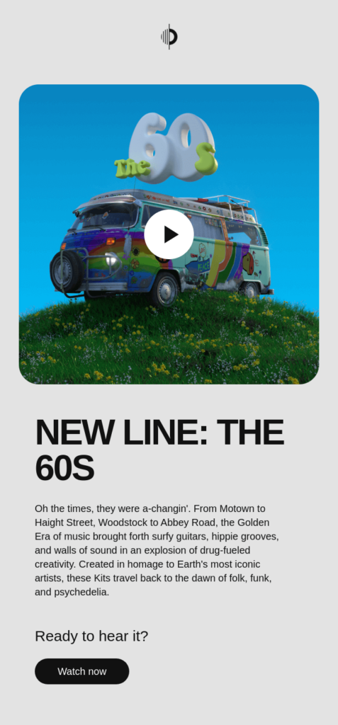
One of the hot trends in email design is consciously investing space in the design to include a Video asset in the design, to extend the storytelling experience to a broader audience. #inclusivedesign #videoemail
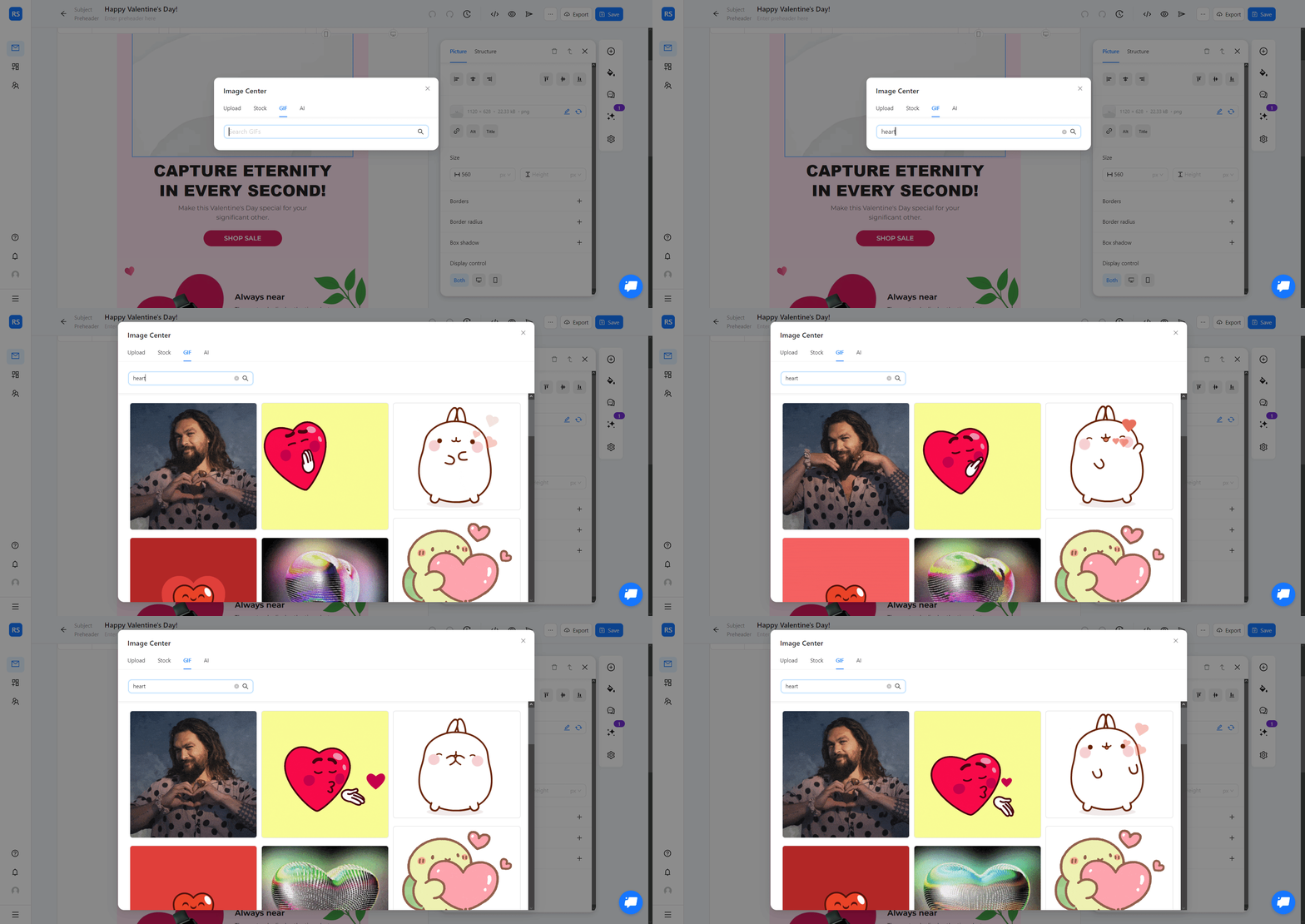
Blocks allows you to add GIFs and YouTube videos to your email directly and with no extra effort. For instance, to include a GIF in your template, all that’s required is a couple of steps:
1. Create your email and add the “Image” element. Next, follow to the “GIF” section in the Image Center by clicking the indicated icon.
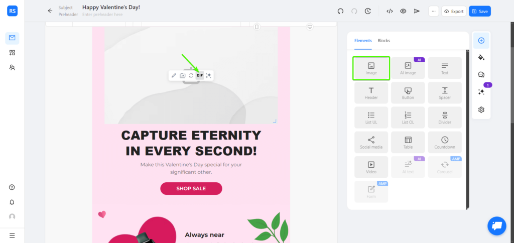
2. After that, simply enter your request, and select the animation for your email template. Easy as pie!
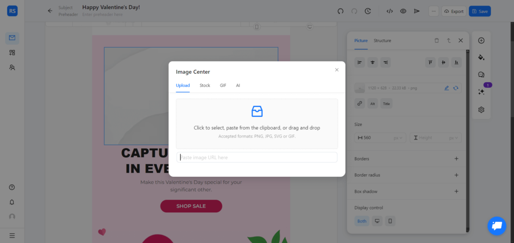
3. Wish to add your custom animation instead? No problem! Choose “Upload” and either select a GIF on your computer or paste the URL.
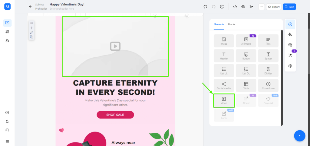
And when it comes to YouTube videos, the process is even easier! Here’s how you do it:
1. Create your template (or choose one from the gallery), select the “Video” element, and add it to your email.
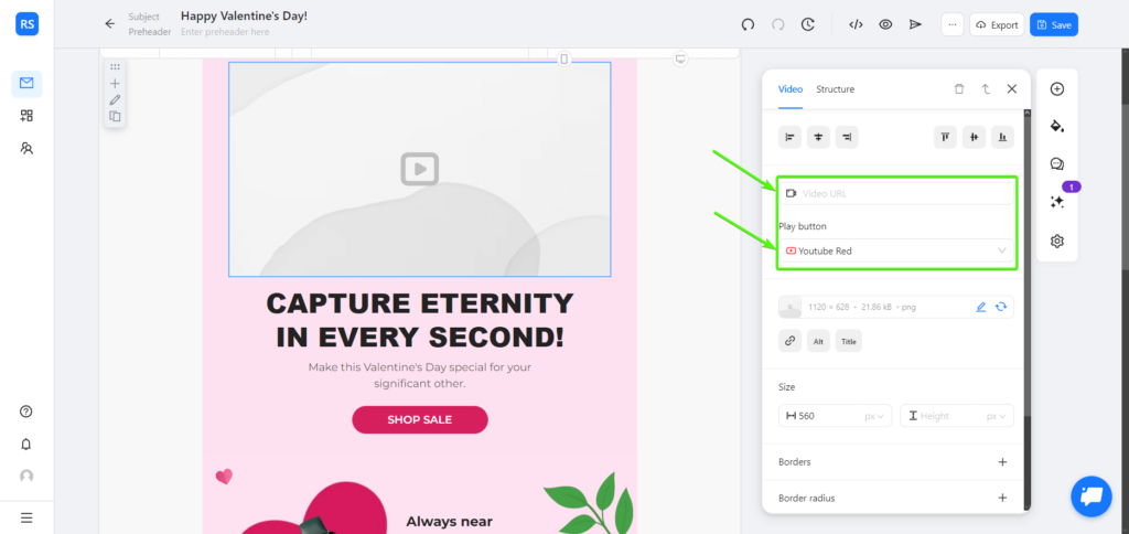
2. After that, paste the video URL, choose the “Play” button style, and edit any other parameters as required. You’re all set!
Craft animated emails with Blocks!
Make vibrant animated emails in a matter of minutes!
Trend #9: Unconventional Typography
Last but not least, we have bold and unconventional typography: a striking detail that adds a touch of vividness to your emails. It brings the information into the spotlight and might be exactly what you need to accentuate the visuals (or even substitute them altogether).
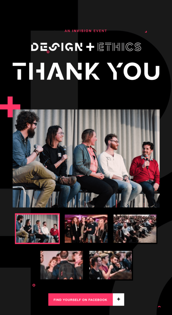
Incorporate inventive font design to make the email stand out like never before. And if you wish to amp up the vibrancy, animate your typography! Though, of course, always remember about the readability: no matter how flashy it is, an unreadable text simply becomes meaningless.
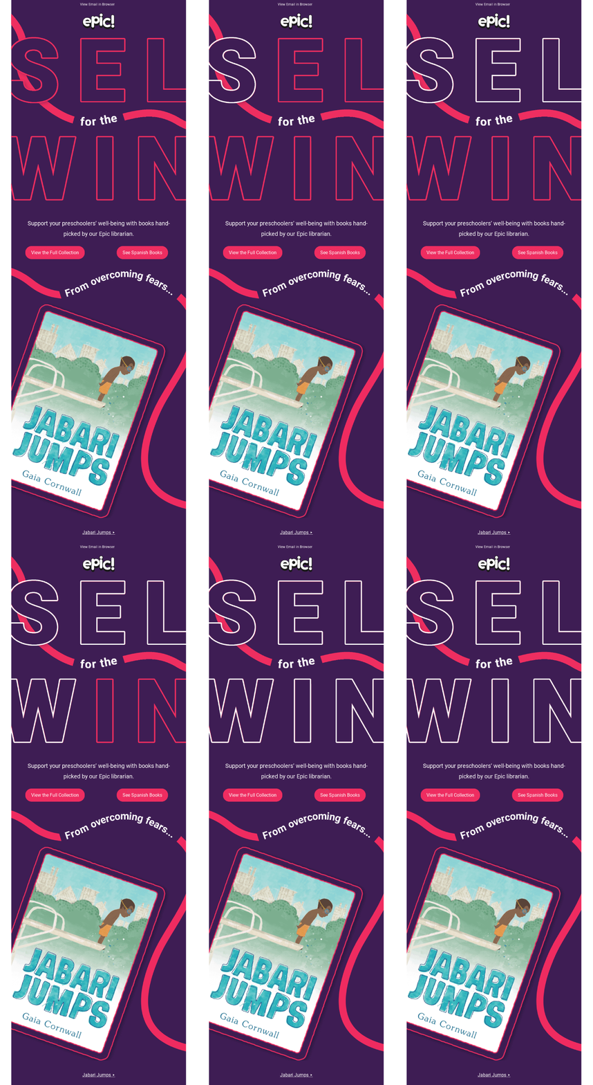
Bonus: Free Trendy Templates for Your Campaigns!
At Blocks, we know how important it is for marketers to keep up with the times. And to give you a head start, here are 4 ready-to-use email templates, each of which incorporates at least one of the hottest design trends.
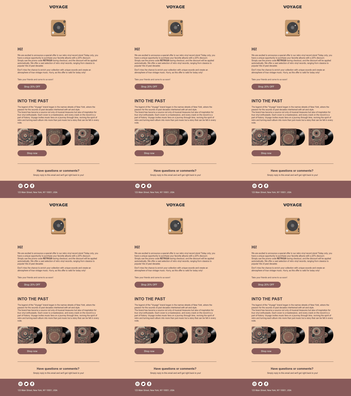
Vintage, Animated GIF & Subtle Colors Email Template
This template combines several trends in one: it makes use of subtle colors, gives off a vintage vibe, and even comes with a funny little GIF! Don’t miss out on this one if you’re looking to create an informative email with a soft and soothing atmosphere.
Unconventional Typography Email Template
Striking typography is what immediately catches your attention here. This email template will be a perfect option whenever you wish to emphasize creative fonts and stunning visuals!
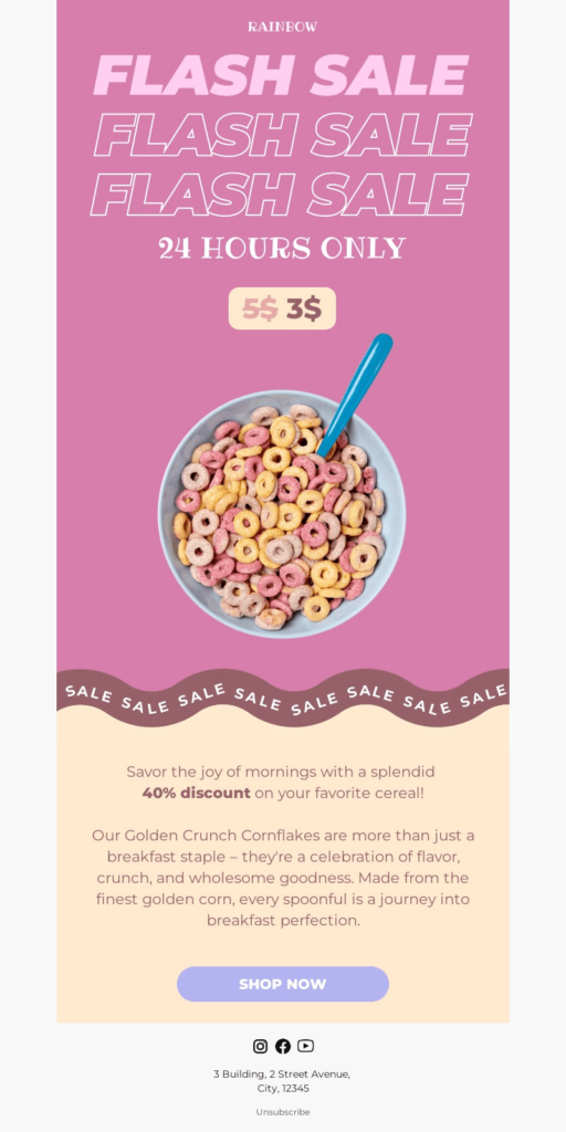
Minimalism Email Template
Ready to implement minimalism in your campaign? Look no further! Simple yet catchy visuals and straightforward text in the email body make this template an exceptional choice if a minimalistic approach is what you’re looking for.
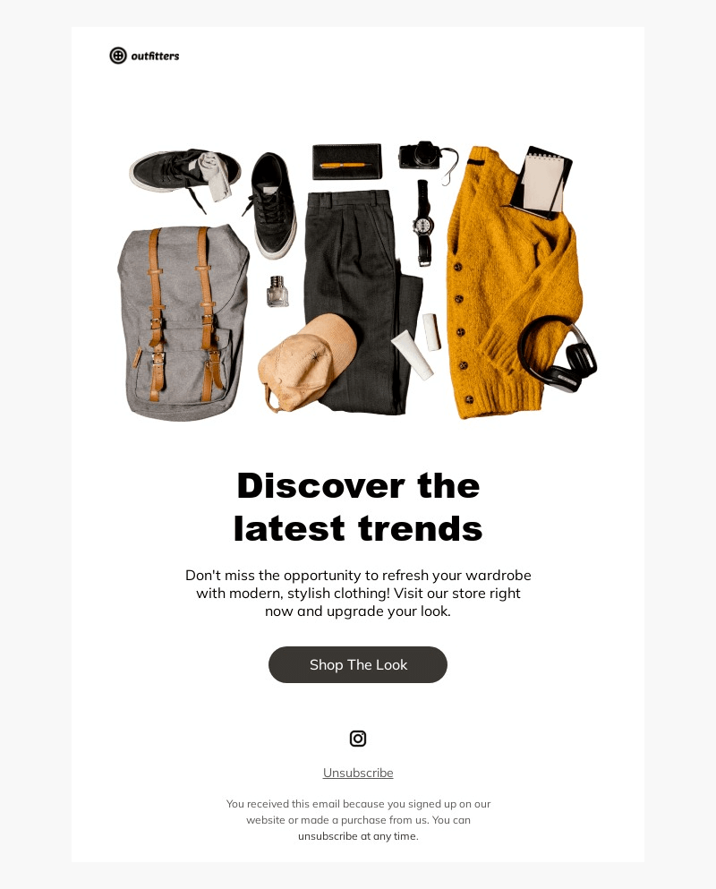
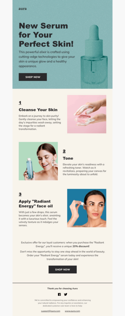
Block Layout Email Template
At last, we have the email that fully takes on the block layout trend. This template will not only become a source of inspiration, but an excellent blueprint for your future campaigns.
Conclusion
2024 brings a vast diversity of trends: from flashy to subtle, from vintage to modern. Perfect time to amplify your marketing strategy! These trends will become your excellent companions and help you leap ahead of the competition:
- engage your subscribers through games, quizzes, and other interactions;
- enliven your email with animated GIFs and videos;
- stick to a true-and-tested minimalistic approach;
- make a standout blocks-based email;
- take advantage of the dark mode in your emails;
- include nostalgic & vintage design elements;
- use subtle colors to illustrate your message;
- add depth with drop shadows;
- turn to bold & unconventional typography in your emails.
No matter which of these trends you want to follow, Blocks will help you design an outstanding template and achieve any goals you may envision! Sign up for free and get to crafting the most effective and trendy emails that will grab attention and stand out in crowded inboxes!
