Newsletter Footer Design: Tips, Examples & 12 Best Practices
The footer (alongside the header and the banner) is one of the email essentials that serves as its closing element. Though more often than not, its significance is underrated. However, with the right approach, the email footer might become an extra traffic source for your website!
Follow our article to check out 12 email footer best practices (illustrated with noteworthy examples) and learn how to create footers that will serve as a valuable user engagement tool for your templates.
Why Email Footers Are Important
Despite being located at the very bottom of an email, the footer remains a prominent and impactful element. Specifically, it carries out 2 significant functions:
- The email footer contains all the vital details and key elements that you can’t place in the email body. Some of this information is not only important but also required by law (we’ll get back to this point a bit later).
- As with the email signature, the footer is your chance to impress the recipients by providing a strong final element. Even the simple footer can be compelling, visually appealing, and engaging for email subscribers!
3 Email Footer Essential Elements
The email footer designs may vary significantly depending on the brand and campaign type. Yet regardless of which design solution you choose, some elements remain mandatory for every email footer. These include:
Clear Contact Details
When you craft a footer, add:
- your company’s address
- phone number
- homepage
This contact information is necessary for the subscribers to reach out to you. On top of that, indicating the name of the company and its mailing address is required by the CAN-SPAM Act (if you’re dealing with the US audience).
Email Preferences / Unsubscribe Link
This is yet another element that falls under the law. Allow your subscribers to customize their email preferences (or unsubscribe entirely if they want to) by including the respective links in your email footer. A good practice here is to highlight the unsubscribe link using bold font or underlining which makes it more noticeable at a glance.
Legal Disclaimers
Include any legal information required for your company or products. No need to place every single detail in the footer itself: you may simply provide a link to the legal disclaimers on your website. However, in some specific cases (for example, promotional offers) showcasing important legal information in the email footer is a must.
How to Create an Email Footer with Blocks
Blocks is a perfect solution to easily design effective footers for your templates! The drag-and-drop interface makes the process smooth and ensures consistency for both the desktop and mobile.
There are 2 ways to create your email footers in Blocks.
Use Pre-designed Footers
This is the easiest way to create an email footer with the help of Blocks. Simply select one of the pre-designed footers and customize it to your liking.
Step 1. Log into your account and either create a new template or select a ready-made one from the gallery.
Step 2. From the menu on the right, select “Blocks” and choose “Common blocks”. Next, click “Footers”. You will see a selection of pre-designed email footers.
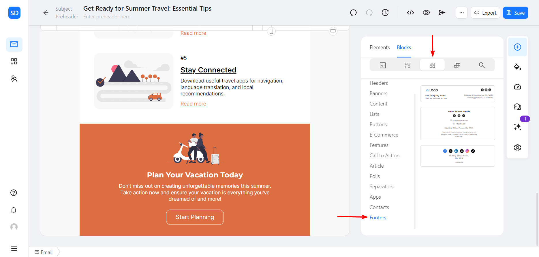
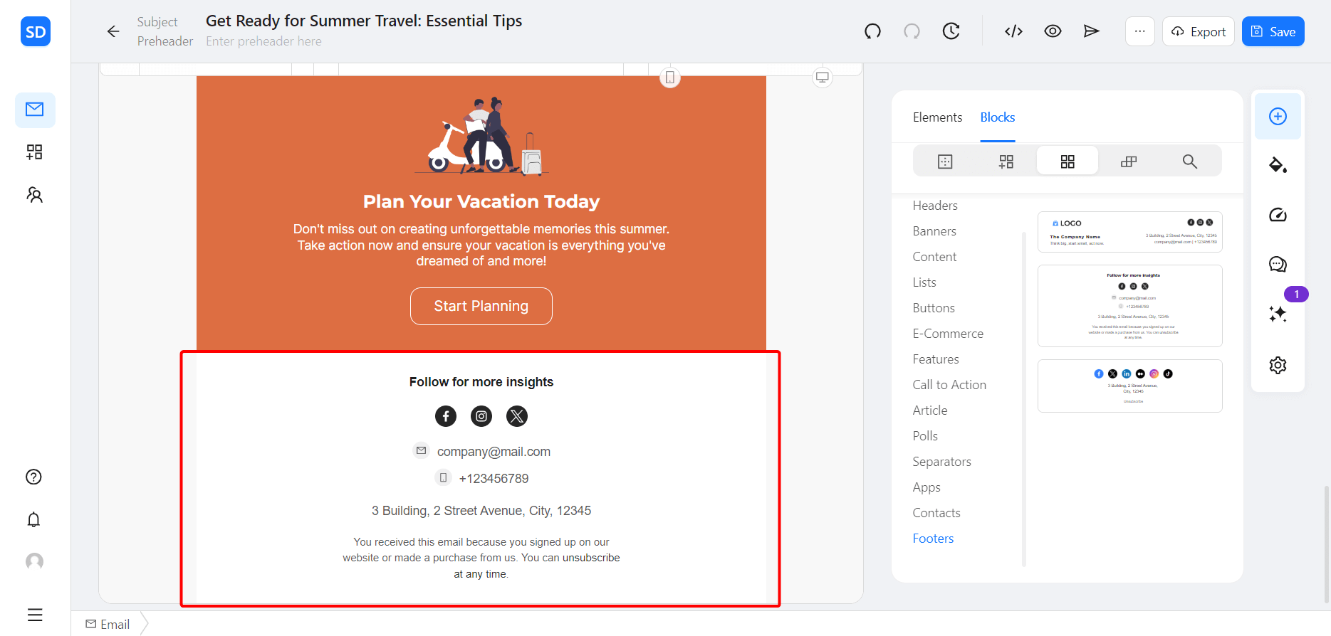
Step 3. Choose the footer you like the most and add it to your template. Now you are free to customize it as you see fit.
From Scratch
The second option is for those who want to create custom email footers from the ground up. Once again, all it takes is 3 steps.
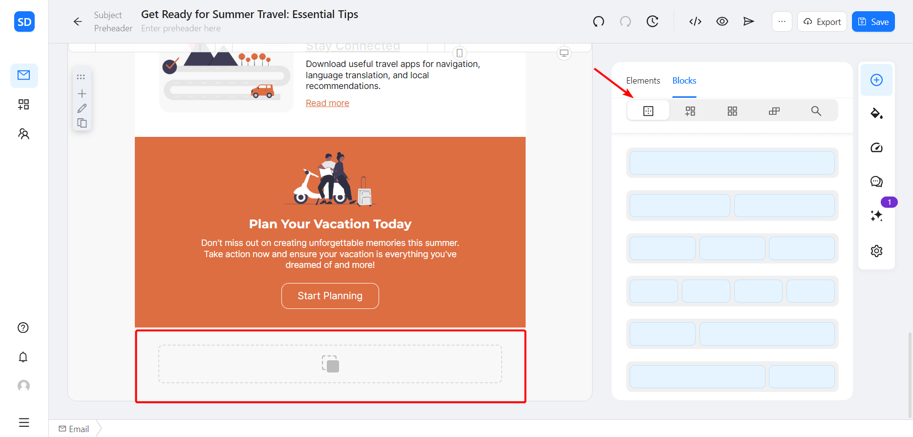
Step 1. After logging in, click “Empty blocks” and choose an empty block that suits your template.
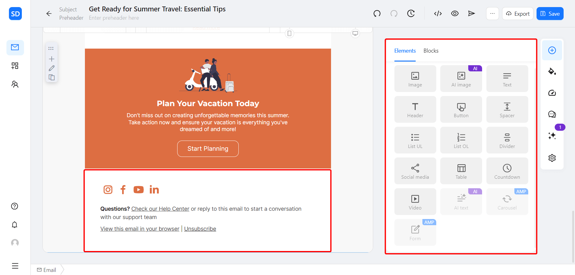
Step 2. Next, click “Elements” and fill your empty block with all the necessary footer content: from company name and business email address to social media links and legal information.
Step 3. Make all the adjustments needed, and you’re all set!
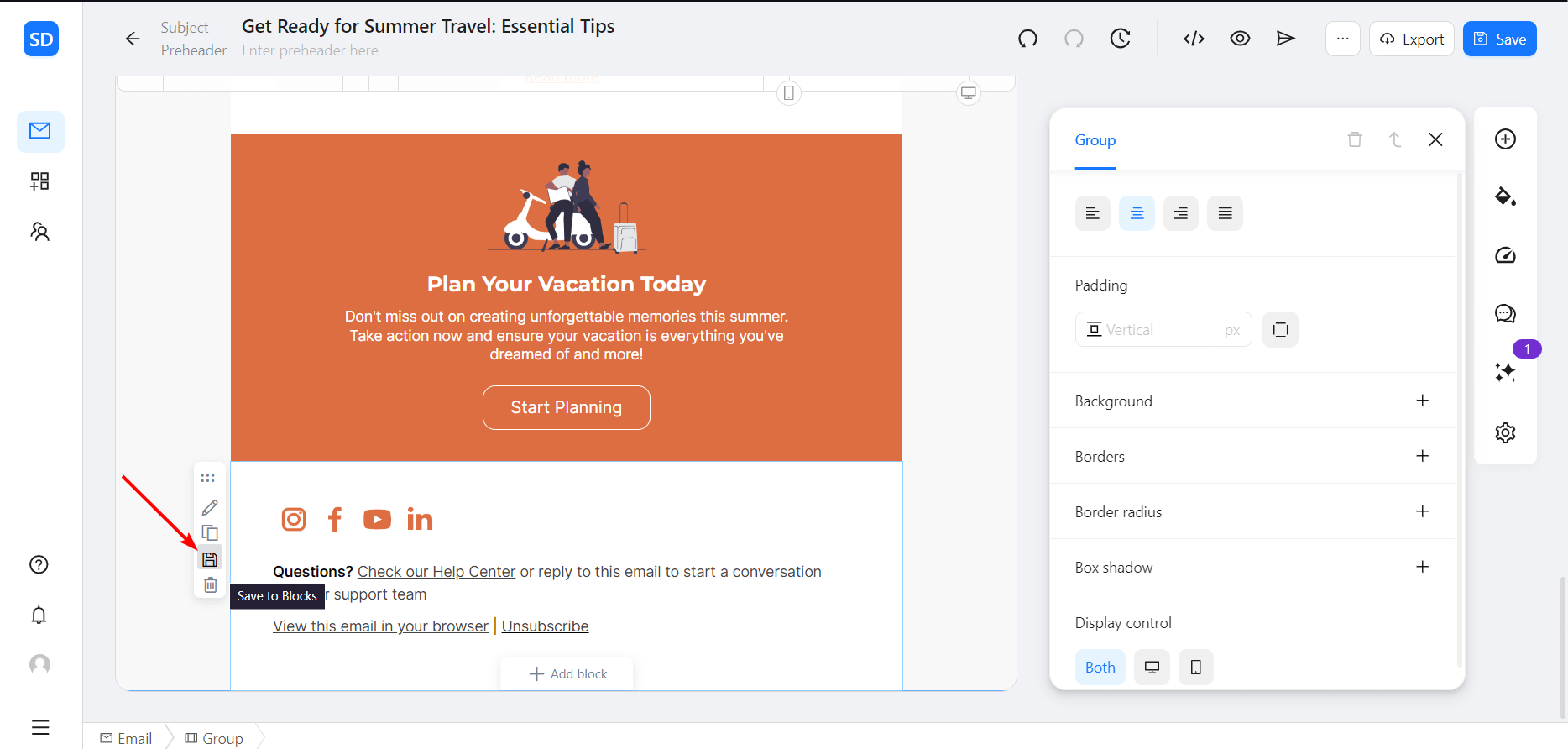
Additionally, you may save your footers as custom blocks for further use. To do this, simply click the “Save to Blocks” icon on the left and enter the name and type of your newly created block.
12 Email Footer Best Practices
And now it’s time to elevate your email marketing campaigns with these 12 email footer best practices (complete with email footer examples for further inspiration)!
Follow Your Brand Design
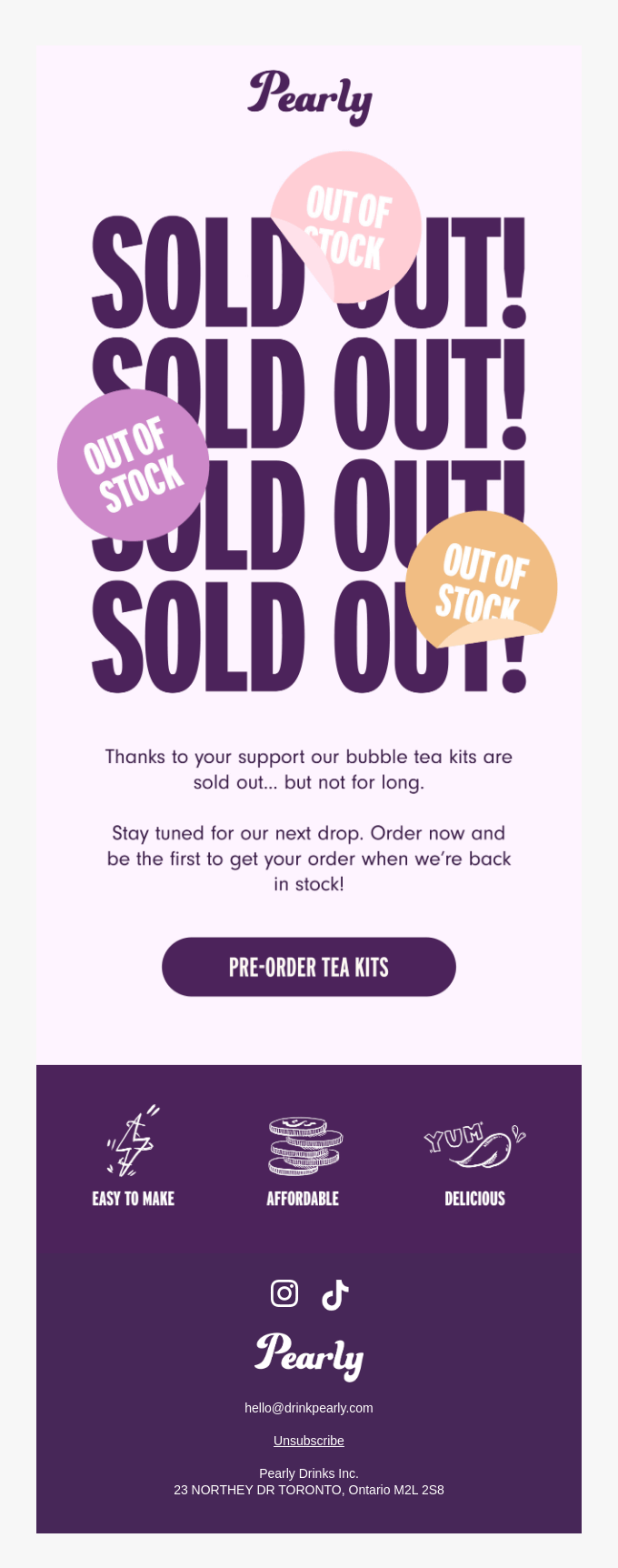
From the company logo to corporate fonts, сraft your footers to fall in line with the overall design of your templates. This is one of the most prominent email footer best practices: it helps to maintain brand consistency and might serve as a great way to underline the overall message.
And if you want to go one step further and make the email more visually appealing, separate the footer from the rest of the email using a different background color (exactly how Pearly did in this email example).
Don’t Overload the Footer
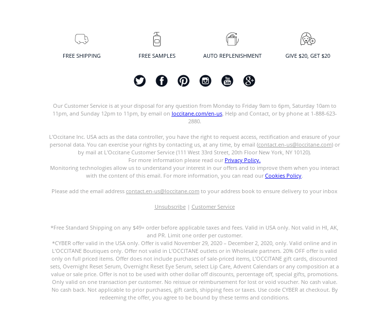
In most cases, a simple footer is your best option. Too much text and visuals might make it look cluttered and hard to digest (especially considering that the text in email footers is usually way smaller). If you have a lot to share, simply provide links to the relevant website pages.
Here, L’Occitane USA shows an example of a crowded email footer, with lots of detailed information that most people would probably ignore.
Optimize for Different Devices
The power of mobile devices in the modern world is evident: almost 1.7 billion people worldwide read emails on their smartphones. This fact makes mobile optimization one of the most significant practices.
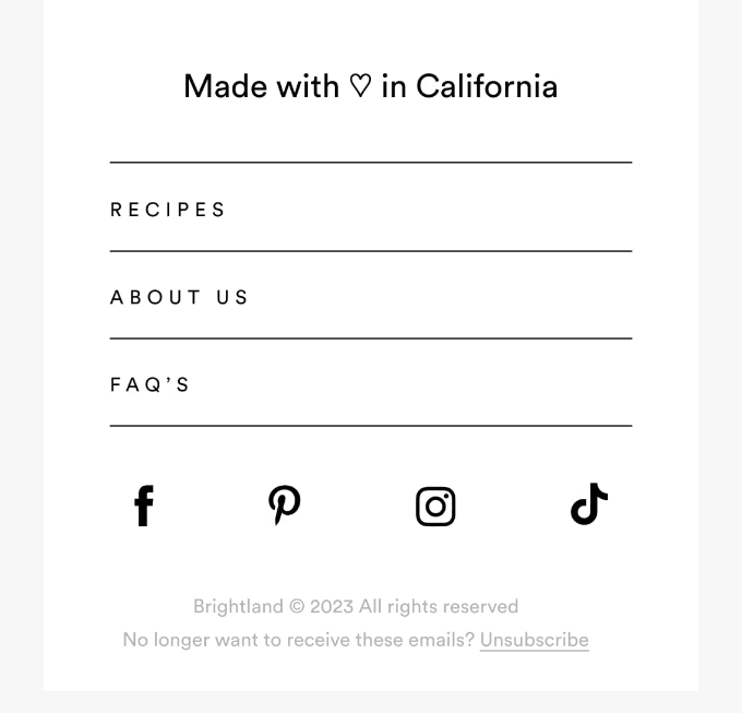
Every element of your template must look excellent on any device, be it a PC or a smartphone. Conduct thorough tests before putting your marketing emails to work and check that all components, from header to footer, look and act exactly how they should.
An email by Brightland provides one of the best email footer examples here, with a design that’s perfectly optimized for mobile devices.
Include Social Media Icons
77% of businesses use social media channels to communicate with their customers. The advantages here are huge: this practice provides additional engagement and opportunities to connect with the audience.
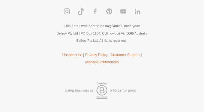
Your company has pages on social networks? Then be sure to include the social media links in your email footer as well! And to make them noticeable to the max, use familiar social media buttons that represent the platforms.
For instance, this footer by Bellroy showcases a wide variety of social media accounts, from Instagram to LinkedIn.
Add App Download Links
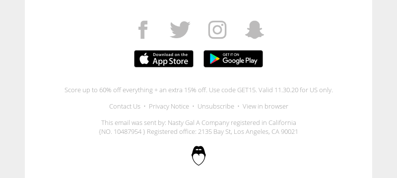
Did you know that 1 out of 3 Americans prefer mobile apps for online shopping? If your brand has a mobile app, inform your subscribers about it!
Design your email footer to include the app download links that lead to:
- Apple App Store
- Google Play Store
- other trusted application stores
- your brand’s web page
Make these links highly visible, and don’t forget to test them.
For the illustration, take a look at one of the best email footer examples by Nasty Gal.
Include a Reminder
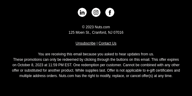
Another good practice is to remind the subscribers why they receive email campaigns from you in the first place. Show the recipients that your messages are not random or spontaneous to avoid the “Spam” folder and excessive unsubscribes.
How do you do that? For instance, include a phrase like “You are receiving this email because you asked to hear updates from us” (as Nuts.com did in this example).
Make Use of Referrals
Invite subscribers to actively participate in your email marketing campaign by providing a “Refer a Friend” link. This simple footer element encourages the recipients to share the email and serves as a great way to attract new audiences at no extra cost. And for additional engagement, create a dedicated referral email to increase the subscriber base even further!
No need to be very fancy, either. Here’s a great example by Fatty 15 that keeps the “Refer a Friend” link (and the footer as a whole) plain and simple.

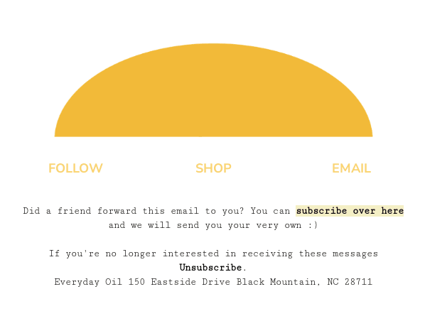
And for cases when the email is referred by a friend, include the respective notice in your footer as well. This example by Everyday Oil shows how this can be done.
Update the Email Footer Frequently
Keep the footer up-to-date and revise its contents on a regular basis. Specifically check for:
- dead links (including your accounts on social media platforms and app download hubs)
- obsolete data (from phone numbers and email addresses to legal disclaimer changes)
- any small details (since those might be easily overlooked)
Otherwise, you risk sending an outdated email to thousands of recipients and losing some of them as a result.
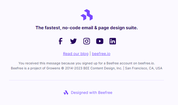
For example, the footer in this email by Beefree (received in October 2023) uses the old Twitter icon, even though the rebranding took place in July 2023. Whenever such changes occur, it’s important to notice them and make timely amendments.
Use Jokes Carefully
An appropriate joke might work wonders for your brand, and sometimes even become its trademark. Take your brand style and audience into account to determine which type of humor might be suitable (and if you even need it at all). Conduct A/B tests and examine the results before including jokes in your email footers.
Here are 2 effective examples to illustrate this tip:
- Threadheads goes for a more daring approach (though in its case, this falls in line with the email style and brand positioning).
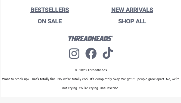
- The email footer by Surreal, on the other hand, uses a more neutral tone and includes a clever pun, which might be a better fit for the general audience.

Share Your Mission
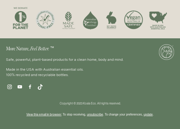
Statistics show that around 64% of consumers prefer brands to openly state their purpose. Dedicate one or two sentences in your footer to showcase your brand’s values and goals, as Koala Eco did with its email footer. This might increase credibility and attract those subscribers who see importance in such acts (and possibly even share your values).
Include a Rating Scale in Your Email Footer
Provide a bit of interactivity in email footers by including a rating scale. This may take different forms, for example:
- simple numbers
- smiley faces
- thumbs up / thumbs down
- stars
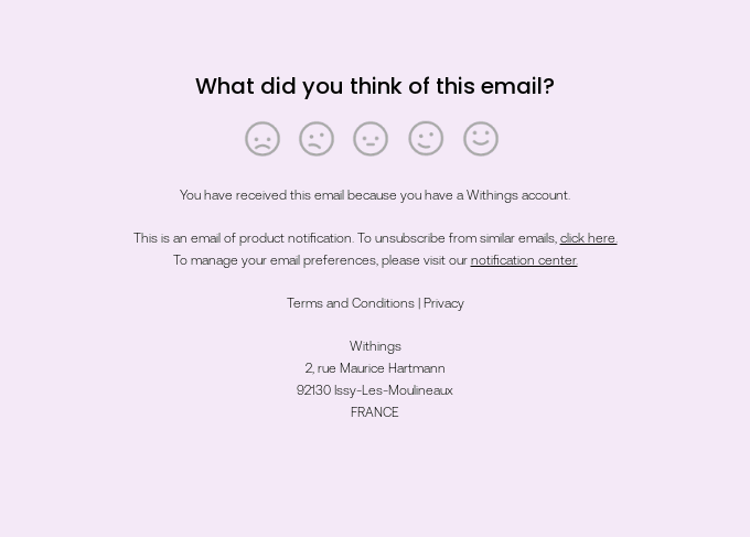
Let the subscribers share their opinions about your marketing campaigns: what they like and what you should improve. This might help you collect direct and valuable feedback without the need to craft a separate survey email.
Here’s a great example by Withings: the footer includes a scale of 5 smiley faces, each expressing a distinct emotion.
Add More CTAs
Finally, make your newsletter footer even more engaging and vivid using a number of calls-to-action! For instance:
- Include a menu for different sections of your website.
- Offer the recipients to read your latest blog post and add a button with a link.
- Seamlessly combine several options (e.g., a menu and a referral link).
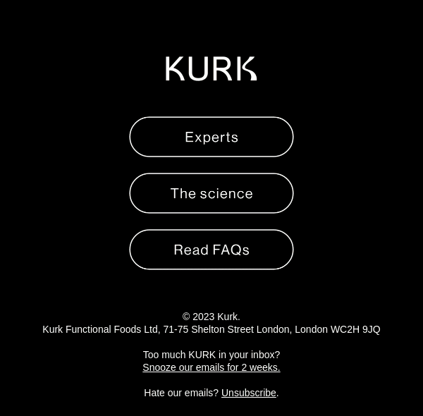
As an example, here’s the email footer by Kurk that shows a button menu.
Conclusion
Even the simplest footer requires a professional approach to be effective. The following pieces of advice will help you craft a footer that adds engagement to your newsletter:
- always include the essential information like physical address, contact details, and preferences/unsubscribe links
- ensure brand recognition by keeping the footer in line with your brand design
- include social links for additional outreach
- keep the email footers simple, without excessive elements
- ask your subscribers to share feedback and refer a friend to boost social proof
- share your brand values, missions, and goals
- optimize your email footers for mobile devices and update them regularly
- use jokes and puns without going overboard
Crafting an email footer sounds complicated? Blocks, an AI-powered no-code builder, brings fun into the process! Thanks to our powerful tool, you’ll be able to create excellent email templates and fine-tune every element with ease.
Speed up your email production with Blocks!
From header to footer, create email templates in a few clicks.
