13 Newsletter Header Design Ideas for an Outstanding Email
Welcome to a comprehensive guide to mastering newsletter header design. This article will take you through the concept of email headers, their different types, and inspiring design ideas. Ready to give your emails a visual boost? Let’s dive in!
What Exactly is an Email Header?
There are two main approaches to the term “email header”:
- the header information in a traditional email message;
- the “header” section within an HTML email template.
Both serve essential roles within their respective contexts, yet they differ significantly in terms of their content, purpose, and the way they are interpreted.
The traditional email header refers to the initial section of the email containing metadata: the sender’s email address, the recipients’ email addresses, the subject of the email, and various technical aspects related to routing, authentication, and encoding of the email.
Most email clients display only the simplified form of the headers (e.g., “From”, “To”, “Subject”, and “Date”). To view the full header information, users typically need to access a specific option within their email client.
To understand what an HTML email template header is, let’s first break down the typical structure of an email. Generally, an email template consists of the following components:
- Header. This is the first thing a recipient sees. It’s the upper part of the email template containing the main information about the company (e.g., the company’s name, logo, navigational menu, etc.).
- Body. This is the main part of the email. It contains a newsletter banner, text, images, links, and other content.
- Footer. This is the part at the bottom of the email. It often contains information like the sender’s contact details, social media links, and legal information like a privacy policy link, and an unsubscribe link. Depending on the kind of email you’re sending, you may replace the standard footer with an email signature.
Main Components of a Newsletter Header
Companies and their specifics differ a lot, that’s why the components of an email header can also vary depending on the function of a particular email. Typically, you can find the following elements within an email header:
- Logo. The company’s logo is a crucial part of any newsletter header. It helps establish brand identity and consistency, making it instantly recognizable to recipients. For example, a company like Apple would include their iconic logo in the header to immediately convey who the email is from.
- Company name. If your company’s logo doesn’t contain the company name and you’re not as well-known as Nike, Figma, or Apple, consider adding the company name to the newsletter as well. It may help avoid confusion and misunderstanding as your subscribers will definitely understand who the email is from.
- Navigation links. Some newsletters include links to various sections of their website, much like a navigation bar on a webpage. For instance, an eCommerce store might include links to “Men’s Clothing”, “Women’s Clothing”, and “Accessories” in their newsletter header.
- View in browser link. To make sure that all of your subscribers will manage to read the email no matter what devices and email clients they use, add a “view in browser” link to the newsletter header. This may help you increase brand recognition as well, as some of the subscribers may send the web version of the email to their friends.
- Taglines or сatchy phrases. A creative and catchy phrase can spark interest and set the tone for your newsletter. This may include your brand slogan, a short intro for the email, or a CTA. For example, if you’re running a health and fitness newsletter, a tagline like “Your Weekly Dose of Wellness!” could work well.
8 Tips for an Impactful Newsletter Header Design
Email header is the first thing that catches your subscribers’ attention and sets the stage for the content to come. It’s crucial to optimize this section for both aesthetics and functionality. That’s why we’ve gathered 8 tips you should keep in mind when designing your newsletter headers:
1. Consistency with brand identity. If your brand uses a specific color palette or typography, make sure you reflect it in your header. For example, Coca-Cola would use its distinctive red and white color scheme and iconic font.
2. Mobile optimization. More than 40% of people tend to read emails via mobile devices (39% of views come from desktops). So it’s crucial to keep your headers (and the rest of the email) responsive, otherwise you may annoy almost half of your subscribers.
3. Element hierarchy. Highlight the most important elements of your header by using the right sizes, colors, and positioning. The company logo, for instance, should stand out from the rest of the newsletter header so as to not confuse the readers.
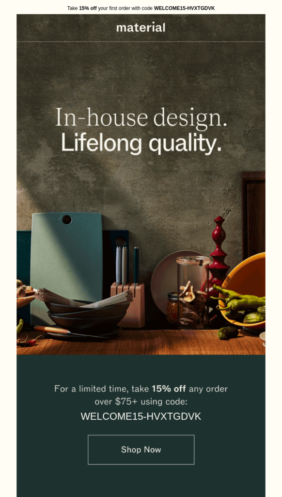
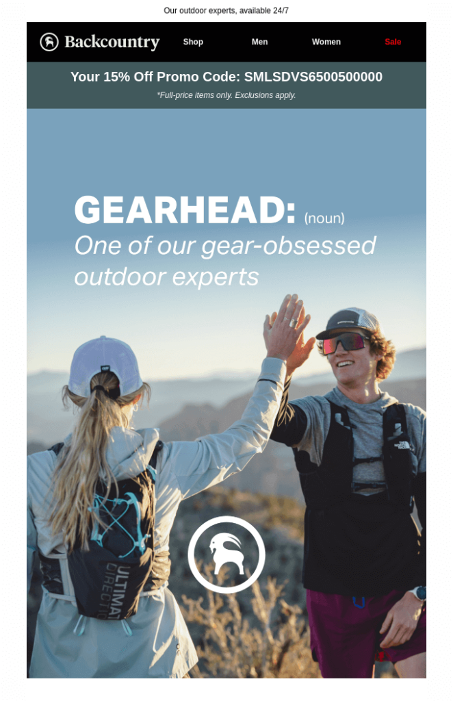
4. Simplicity. We know it’s tempting to pack in various elements into your email header design to make it extra informative, but this approach may create clutter and decrease readability. Take a look at the two examples below. Although both of the headers highlight a personalized offer, the one by Material grabs readers’ attention and is easier to perceive.
5. A/B testing. Test several header designs to identify what works best for your audience. Change one element at a time, such as color, text, alignment, number of elements, to determine which variations show better engagement.
6. Relevance. The content of your header should align with the purpose of your email. For example, if you’re promoting a special offer, your header could include a discount coupon to make sure the readers will see it.
7. Action-oriented. If your email aims to encourage a specific action, consider incorporating that into your header. Imagine you need to send an email inviting subscribers to join a webinar you’re planning to organize. A CTA like “Sign up for the webinar” or “Learn the Details” in your header could boost click-through rates.
8. Use of email builders. Leverage email building tools like Blocks to create professional-looking headers without the need for extensive design experience. Simply drag-and-drop ready-made elements into your header and adapt it to the needs of your campaign.
2 Ways to Create Your Newsletter Header in Blocks
Blocks offers a range of features that simplify and streamline the process of crafting responsive emails. We’ll share two main ways to build appealing headers using Blocks.
Use pre-designed blocks
This is probably the easiest thing you could do as Blocks comes with a variety of pre-designed blocks that can be dragged and dropped into your newsletter. Here’s what you should do to access pre-designed headers:
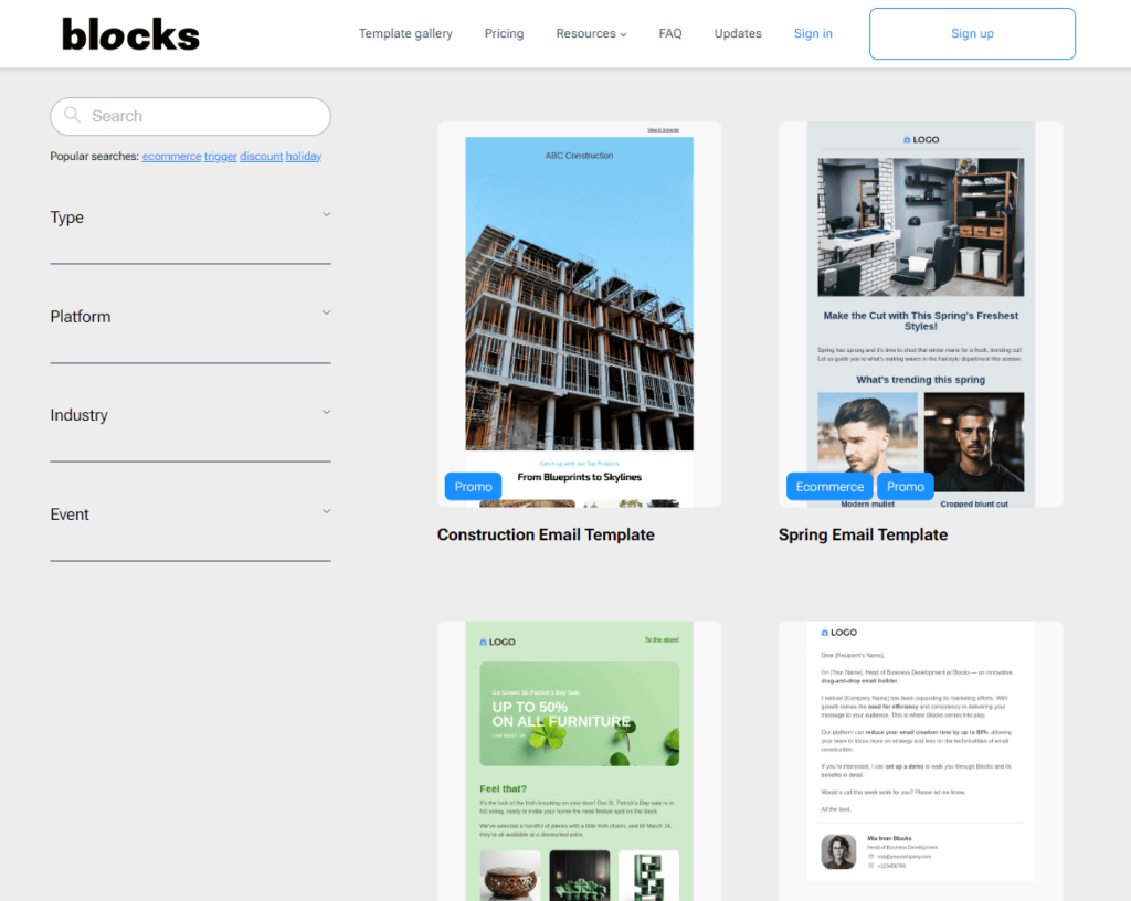
1. Log into your Blocks account (or, if you’re new here, create one for free). After that, select the template you like from the gallery or start building it from scratch.
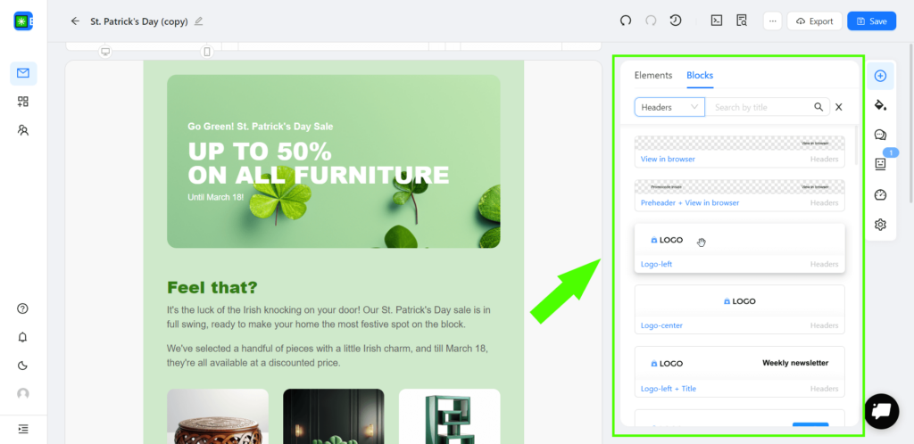
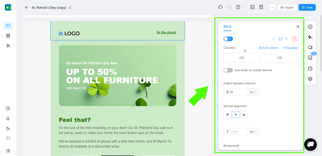
2. No matter what option you’ve chosen at the previous step, you’ll see a list of blocks on the right of your email template. Select “Headers” in the menu and you’ll get plenty of email header designs to choose from.
3. Simply drag the header that suits the needs of your email campaign most and drop it at the top of the template.
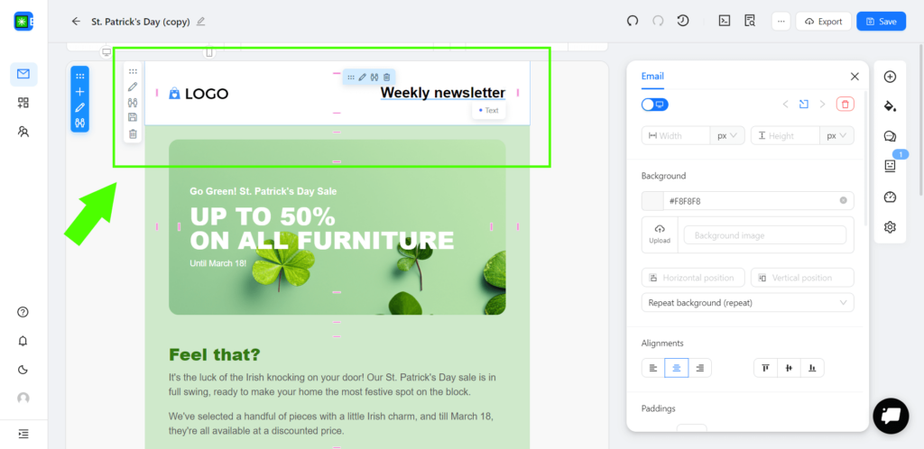
4. The only thing left is to adjust the colors and text to match the content of your email. Don’t forget to add all the necessary links and check that they’re working properly. Now your email is ready to win your subscribers over!
Use empty blocks and elements
If you couldn’t find the perfect header in the list of blocks or if you feel like creating everything yourself, this section is for you! After you’ve logged into your account and created a template, here’s what you should do next:
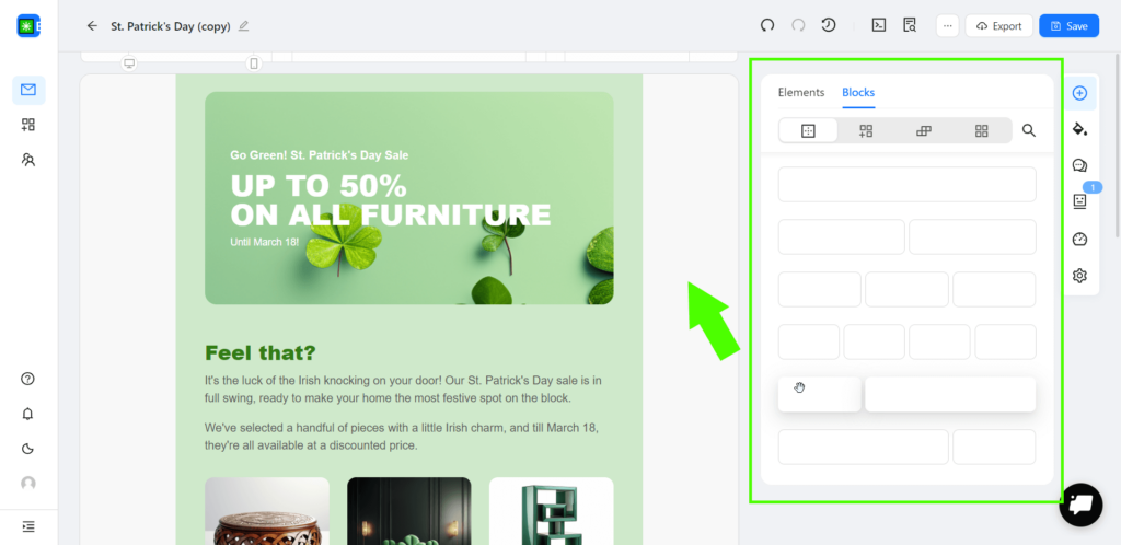
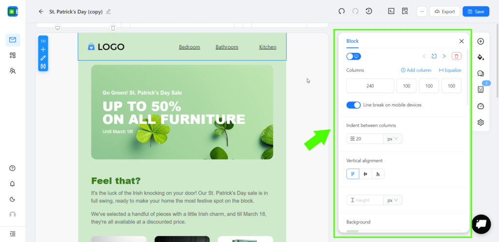
1. Open the “Blocks” section on the right and click on the “Empty blocks” button. Choose the one you need, then drag it to the top of your email, and drop it there.
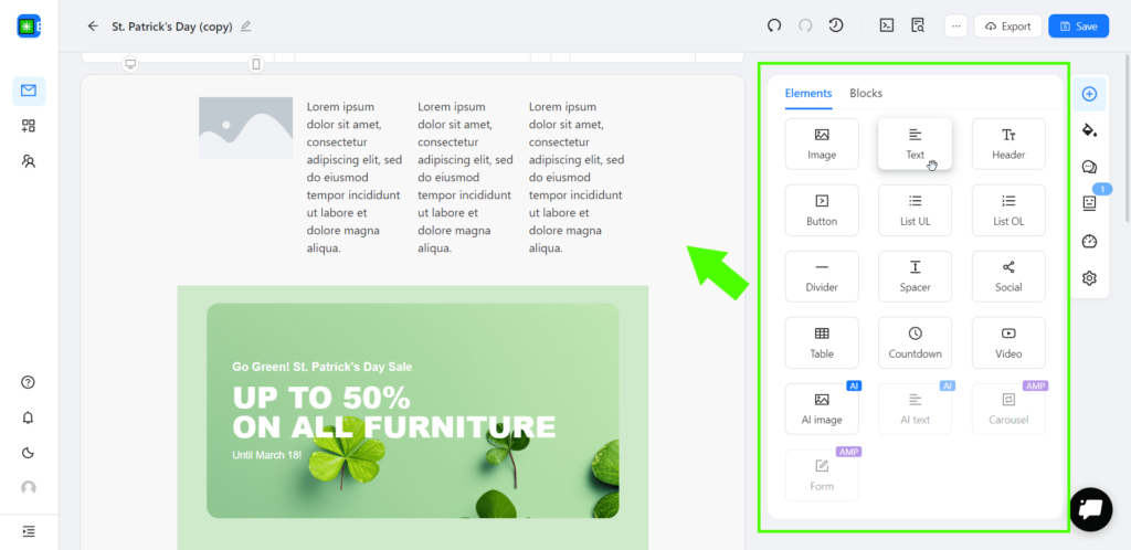
2. After you’ve added the empty block, go to the “Elements” section and choose the desired elements: for example, if you want to showcase your brand logo and main website categories, you could add an image and several text elements to the template.
3. Now all you have to do is upload your logo, edit the text elements, and adjust the colors to align with the rest of the email.
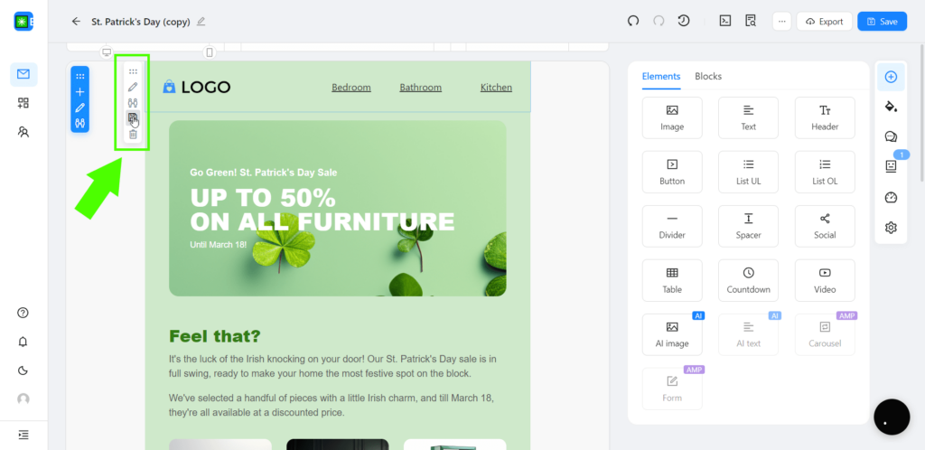
When your email header design is ready, you may save it as a custom block to speed up email production in the future. To do that, click on the “Save to Blocks” button on the left of the block and fill in the name and the type sections for better navigation. Next time you need to create an email, simply add your custom block to the template and free up some time for other important tasks.
Create your newsletter header in Blocks
Build custom blocks for your emails with our builder in a blink of an eye!
13 Unique and Actionable Newsletter Header Design Ideas
Designing a header that captivates your subscribers from the get-go might seem daunting at first, but with a dash of creativity and a sprinkle of inspiration, nothing is impossible. Here are 13 unique newsletter header design ideas that can spark your imagination and help you create beautiful and impactful email headers:
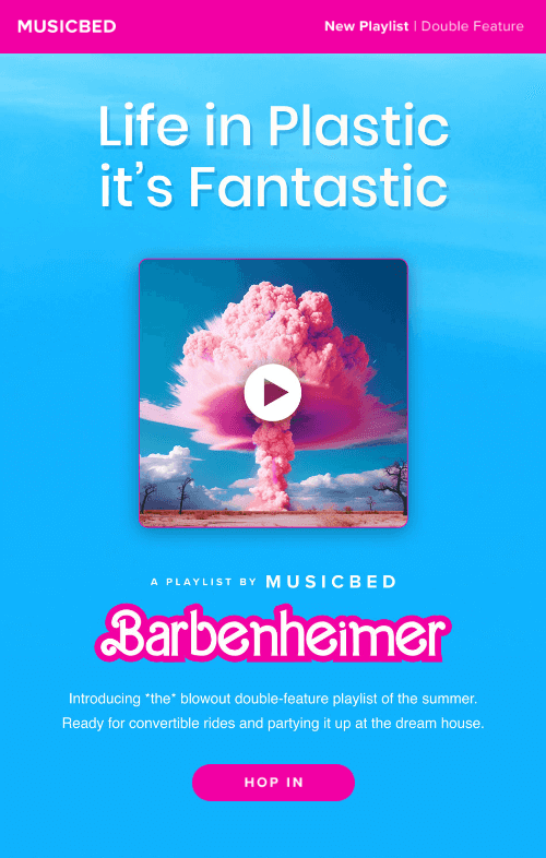
1. Be bright. If you wish to make an immediate impact, being a bit adventurous with the header design might be a good idea. Vibrant colors and large, attention-grabbing fonts will definitely leave an impression.For instance, if you craft a summer sale newsletter, use sunny yellows or radiant oranges coupled with a large font to convey excitement.
The Musicbed example below shows how the use of bright pink in contrast with blue grabs your attention the moment you open an email.
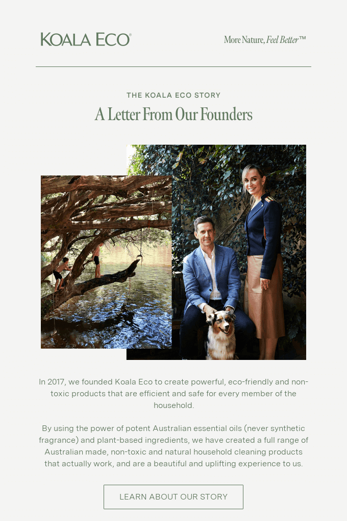
2. Minimalist magic. In case your business thrives on simplicity and elegance, minimalist design may become a wonderful option. You can use a monochrome color scheme or limit yourself to two colors only while maintaining plenty of white space. A classic black-and-white layout with a simple serif font can work wonders, giving your newsletter a timeless appeal.
Koala Eco email perfectly demonstrates the use of such a newsletter header design idea, conveying the message in a simple yet exquisite manner.
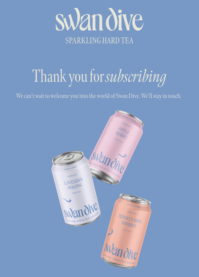
3. Bold typography. A bold, eye-catching font might be a great choice for your email header design to stand out. Distinct typography can create a strong impression and keep your design clean and clear, while the use of a heavy, sans-serif font provides a modern, impactful look.
A perfect illustration here would be this Swan Dive email, with a highly stylized brand name that makes the header stand out.
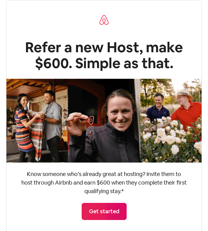
4. Emphasis on logo. For your brand logo, making it the central component of your header could be a nice option. Make sure your logo is large enough to be easily recognizable. This newsletter header design idea works especially great for brands with well-known logos and serves as a great approach to strengthening brand recognition.
Here is a great example: Airbnb needs no introduction, and in this email puts its whole emphasis on a company’s immediately recognizable logo. Same is true for many other well-known brands who incorporate stylized logos in their marketing strategies.
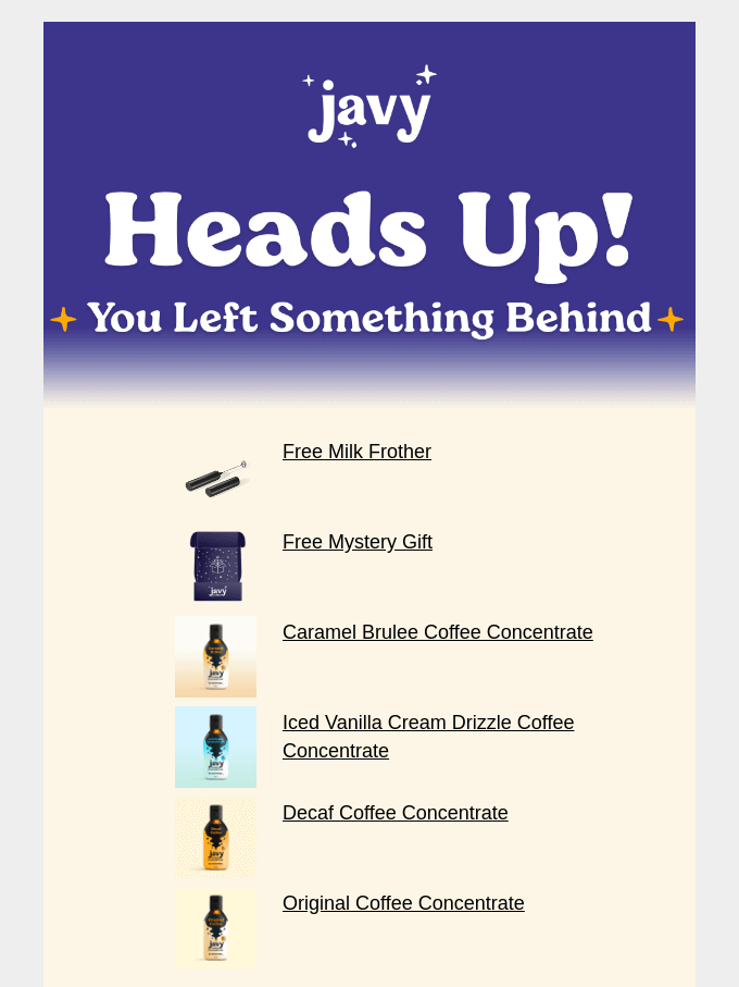
5. Use of shapes. Try incorporating basic shapes like circles, squares, or lines to create a simple yet visually intriguing design. For example, use lines to frame your newsletter title or create an abstract pattern while keeping the email smooth and clean.
The Javy email below makes use of simple four-pointed star shapes, creating an appealing header without excessive complexity.
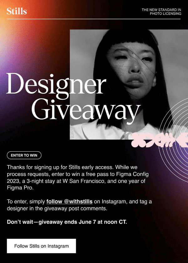
6. Gradient colors. Use subtle gradient colors in a header background to provide additional depth and visual appeal without the need for images or extensive text. This subtle tip is very useful for creating a minimalistic yet captivating header.
Email by Stills shows a great example of this newsletter header design idea, with a small gradient piece in the upper left corner providing space for the brand logo while seamlessly blending in with the rest of the email.
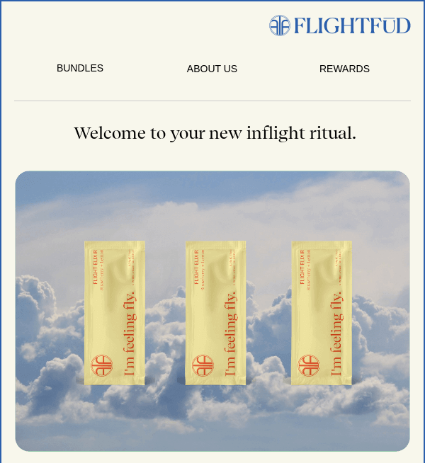
7. Play with alignment. Instead of the standard left-aligned text, try experimenting with center or right alignment. Simple yet effective, this small detail can play a huge role in making your design stand out.
FLIGHTFUD makes use of this newsletter header design idea in its email by placing the brand name on the right.
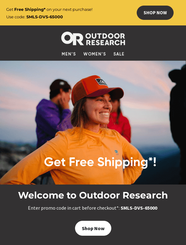
8. Personalized offer. Show your readers that you know and understand them. For this, make use of personalization capabilities to include the reader’s name or reference their previous purchases in your header. As an example, a header that reads something like, “John, Check Out These New Books Based on Your Reading History!” can drastically increase engagement.
In this example, an email from Outdoor Research immediately greets the reader with a personalized exclusive free shipping code.
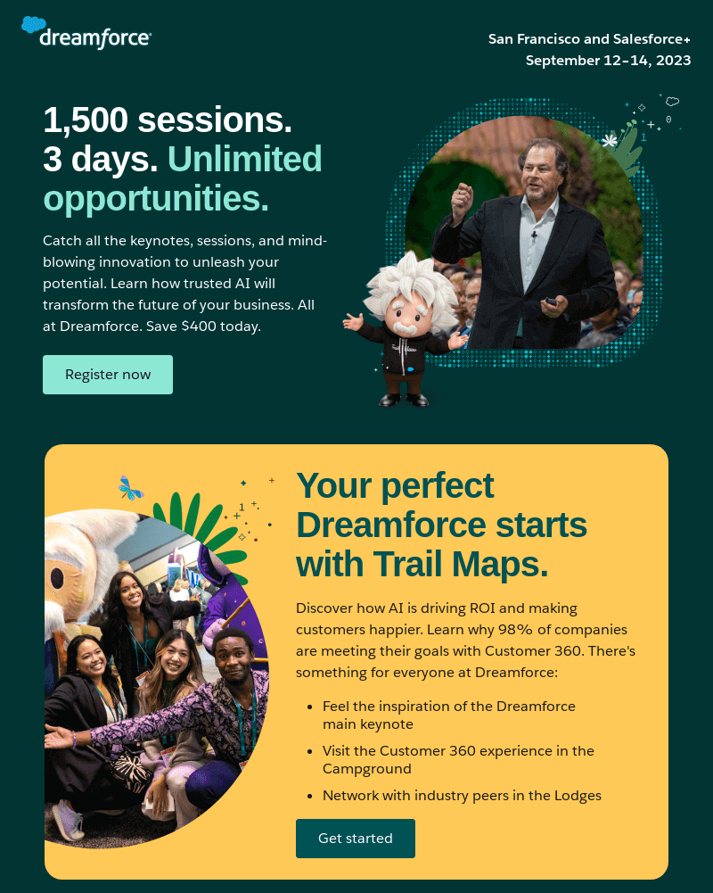
9. The teaser. A great newsletter header design idea would be to include a sneak peek into your newsletter content to spark additional curiosity. For example, if your newsletter features an exclusive interview, your header might read, “Check Our Interview with Entrepreneur of the Year to Discover the Key to Success”. This gives the readers a hint on what’s inside, enticing them to learn more.
Salesforce’s email here wastes no time, immediately providing details on the upcoming Dreamforce event right in the header.
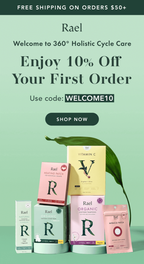
10. Monochrome elegance. It’s perfectly okay to not overcomplicate things. Something simple and down-to-earth, like using a monochrome color palette, can give your email a sophisticated, polished look. Make use of your brand’s primary color and its various shades for the background, imagery, and text in your header to create a unified, visually appealing effect.
This email from Rael, for example, uses shades of green to a great result while keeping the design in line with the brand image.
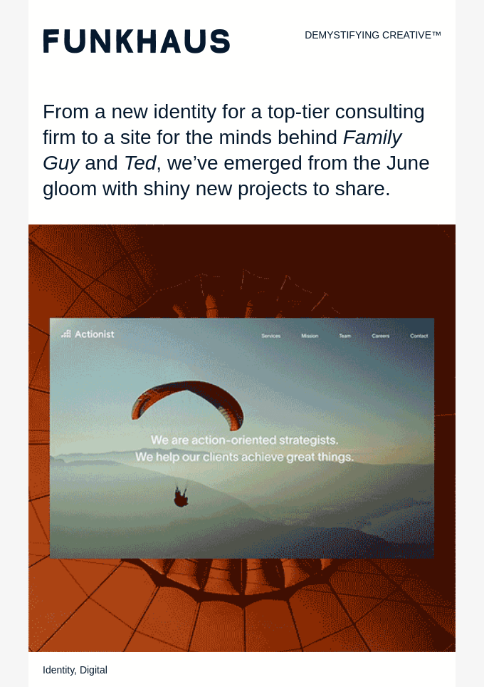
11. Brand slogan. Slogan is one of the essential elements that conveys your brand’s values and goals. Adding a slogan beside the brand name or logo may increase recognition and serve as a reminder for those who are already familiar with what you have to offer.
Email by Funkhaus shows exactly that, with a header containing a brand name on the left and a slogan on the right.
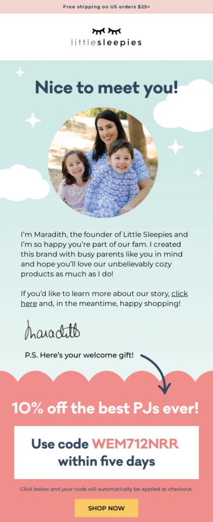
12. Illustrate your offer. This newsletter header design idea allows you to grab the reader’s attention from the get-go by providing a deal right at the beginning of the email. Showcasing a discount or an interesting offer in the header can pique interest even before one gets familiar with the email’s content.
As an example, this email from Little Sleepies immediately greets the reader with a message on free shipping, sparking curiosity and desire to read further.
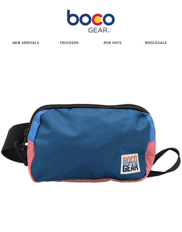
13. Add menu. Showcase your offers in the header, but don’t go overboard: an overwhelming catalog is not a good fit for a simple email. For instance, you may put an emphasis on the most relevant and demanded product categories that can lead the readers right to your platform.
Boco email shows this best, with the menu being placed right after the logo.
Conclusion
A well-designed newsletter header is, beyond any doubt, an extremely useful tool that can significantly boost engagement and conversion rates. Through a combination of different tips and newsletter header design ideas, you’ll be able to create a unique and memorable email to captivate the reader and leave a long-lasting impression.
The force of creativity knows no limits, but be sure to remember about the basics, such as to maintain brand consistency, optimize for mobile devices, keep designs simple yet compelling, and test different versions for optimal results. And of course, whether you feel adventurous or strive for something low-key, powerful tools like Blocks are here to simplify and enhance your design process.
Happy designing!
Looking for responsive email templates?
Check our template gallery and try our email templates for free!
