
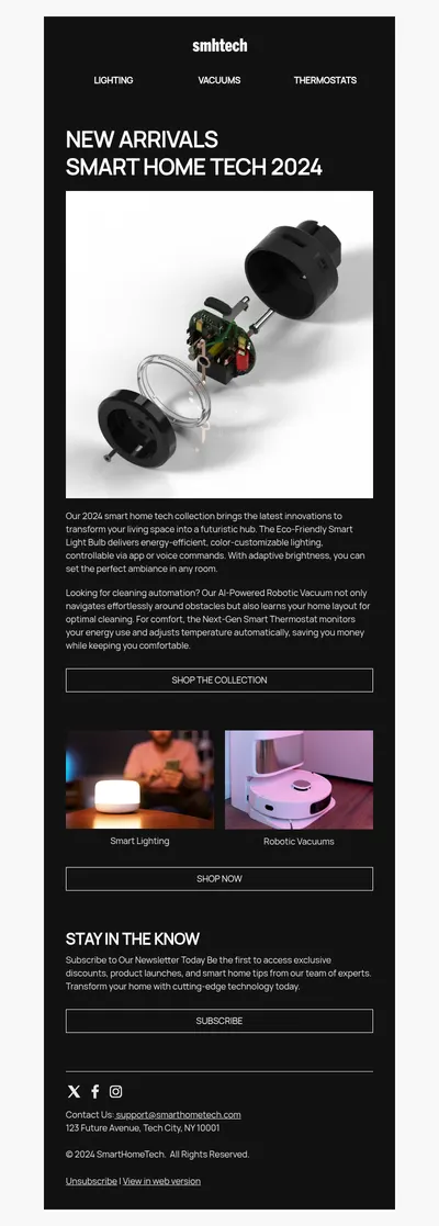
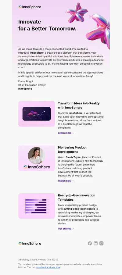
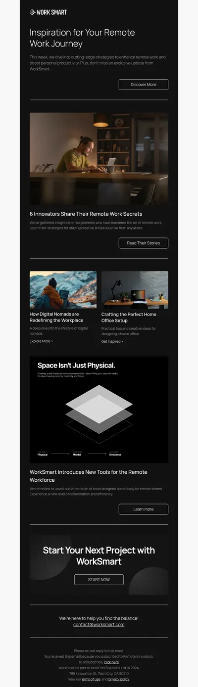
Dark designs have moved from a niche style to a mainstream look for apps, websites, and emails. Deep backgrounds with bright accents feel modern and dramatic, and many readers find them more comfortable in low light. Our dark theme email templates give you sleek layouts that make images and buttons pop while keeping text easy to read.
Why Choose Dark Theme Email Templates
A dark email instantly looks different from the white messages that fill most inboxes. That contrast helps campaigns get noticed and supports brands whose identity is built on a bold, premium, or technical feel.
- Visual impact. Product photos, neon accents, and vivid illustrations stand out strongly against a dark background.
- A premium mood. Dark palettes are often associated with luxury, nightlife, entertainment, and high-end technology.
- Comfort at night. Readers who check email late in the evening appreciate designs that are not glaringly bright.
Dark Design vs. Dark Mode in Email Clients
A dark theme template is designed dark on purpose. Dark mode is different: it is a setting in apps like Apple Mail, Outlook, and Gmail that may change the colors of any email automatically. Each client handles this in its own way, from leaving your colors alone to partly or fully inverting them.
That is why testing matters. In the Blocks editor you can switch the preview between a light and a dark theme to see how your layout holds up, then adjust colors, logos, and images before exporting.
Where Dark Theme Emails Shine
- Gaming and entertainment: release news and events built with our gaming templates or movie templates.
- Tech and software: product updates and launches from the software and technology templates.
- Seasonal campaigns: moody, atmospheric emails for Halloween and Black Friday.
- Music and nightlife: concert announcements and club events from the music templates.
Tips for Dark Theme Email Templates
- Avoid pure black and pure white. A very dark gray background with off-white text is easier on the eyes and reduces harsh contrast.
- Prepare logos for dark backgrounds. Use a light version of your logo, or add a subtle outline, so it does not disappear.
- Check image edges. Pictures with white backgrounds look like bright boxes on dark designs, so prefer transparent or dark-edged images.
- Keep buttons bright. A vivid call-to-action color is essential when everything around it is dark.
- Mind text size. Light text on dark backgrounds can look thinner, so slightly larger font sizes and heavier weights help readability.
Curious about where email design is heading? Our overview of email design trends covers dark layouts among other styles, and the email design guide explains contrast and hierarchy in more detail.
You do not have to switch your whole program to dark emails. Many brands keep a light design for everyday newsletters and use dark templates for special moments, such as a big launch, an evening event, or a limited collection, so those emails feel more exclusive.
Accessibility deserves a final check. Test color contrast for body text and links, and make sure important information never depends on color alone, so the email remains readable for subscribers with low vision or color blindness.
Finally, remember that some subscribers will still see your email with a light background, for instance in clients that override colors. Choosing accents that look good on both light and dark surfaces keeps the design attractive no matter how it is displayed.
Explore Free Dark Theme Email Templates
Choose a template above, bring in your brand accents, and preview it in both themes before you send. A well-crafted dark email can be one of the most striking messages your subscribers receive.